Dimensions: height 342 mm, width 411 mm
Copyright: Rijks Museum: Open Domain
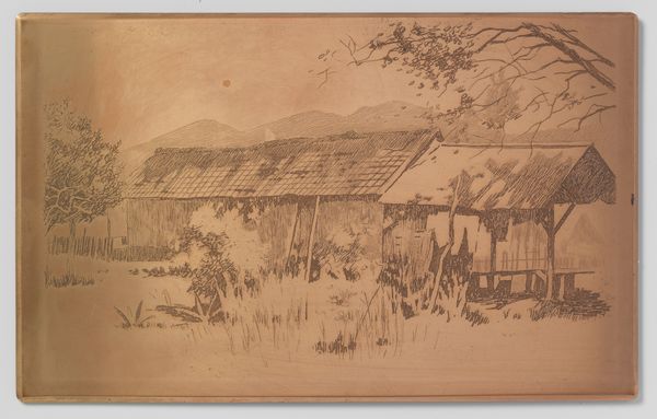
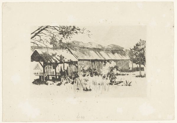
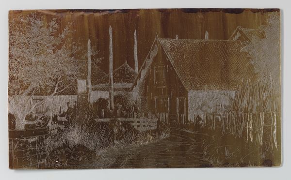
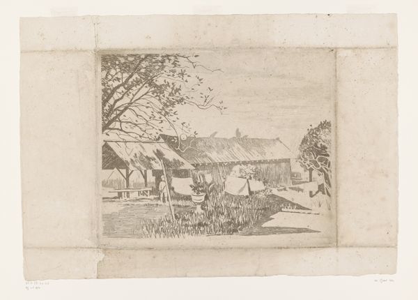
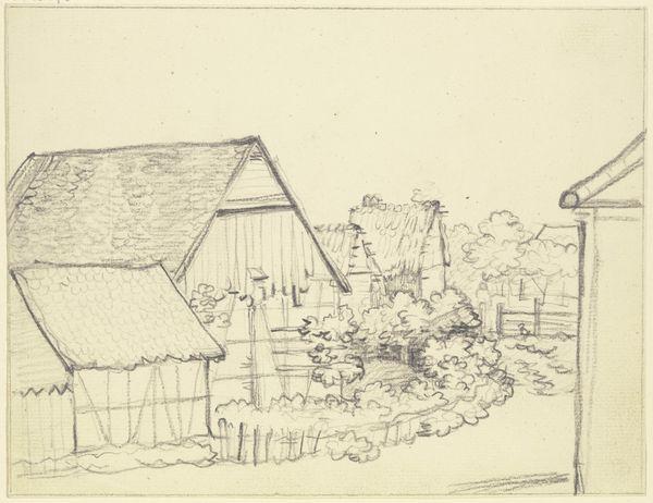
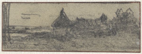
Editor: This is Willem Witsen's "Gambar, lang bijgebouw, drogende was op de voorgrond," created around 1921 using ink on paper. It's currently housed in the Rijksmuseum. The first thing that struck me was the layered effect Witsen achieves. The composition feels complex but grounded. What catches your eye in this piece? Curator: Certainly. The piece employs a remarkable interplay of line and tone. Consider how the varying densities of hatching not only delineate forms – the long building, the drying laundry – but also establish a spatial hierarchy, pushing elements back and bringing others forward. Editor: That makes sense. I noticed the varying lines, thicker and more defined in the foreground than in the background. Is there a purpose beyond just creating depth? Curator: Precisely. Look closely at the textures created: the rough, tactile surface of the thatched roof in contrast to the smoother, flatter expanse of the sky. It's a calculated orchestration. Do you perceive how this contributes to the artwork's overall effect? Editor: It seems the roughness in the roof provides a visual and perhaps textural counterpoint to the smoother parts, balancing them out? Curator: An astute observation. Notice how the stark vertical lines of the building walls offer a structured contrast to the organic, almost chaotic, lines of the tree branches on the right. This dialectic creates visual interest. Editor: So, Witsen seems very intentional with contrasting lines and textures, moving the eye around? Curator: Indeed. By focusing on the internal structure, the arrangement of forms, and the interplay of line and texture, we arrive at a more nuanced understanding of its aesthetic qualities. Editor: I hadn't thought about it so analytically, but I can see how focusing on those elements creates an overall unified visual experience. Curator: A rewarding insight!
Comments
No comments
Be the first to comment and join the conversation on the ultimate creative platform.
More like this