print, photography
#
script typeface
#
aged paper
#
script typography
#
paperlike
# print
#
asian-art
#
personal journal design
#
photography
#
orientalism
#
thick font
#
handwritten font
#
classical type
#
thin font
#
small font
Dimensions: height 213 mm, width 145 mm, thickness 30 mm
Copyright: Rijks Museum: Open Domain
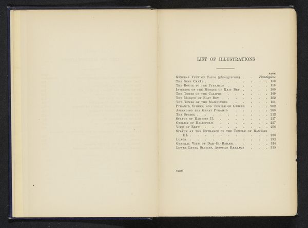
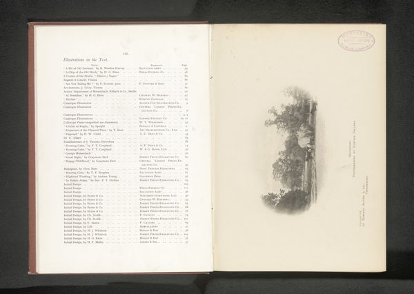
Curator: Here we have the index from a photography book by Douglas Sladen titled, rather insensitively, "The Japs at Home," published in 1892. Editor: Immediately striking is the typography. There's a definite aesthetic at play, balancing these heavier serif fonts for headings against the delicate, smaller script used for the chapter details. It establishes a clear hierarchy but feels aged, papery… quite distant, really. Curator: The choice of title and organization reveal much about the Western gaze during this period. It promises an "insider's" look, but the use of "Japs," a derogatory term, demonstrates an underlying attitude of othering. Editor: True, but looking at the pure composition, the structure is really quite effective. Two columns neatly aligned, offering this visual pathway for the eye to navigate all these illustrations... The designer clearly understood the principles of clear communication. Curator: And communication it is. Sladen's choices, from the book's title to the subject matter, reinforced existing colonial power structures. Notice the section dedicated to “English as She is Spoke” in Japan—this emphasizes a cultural dominance while exoticizing everyday aspects of Japanese life. Editor: Certainly. Even with my formalist inclination, I cannot deny how these textual and structural elements reinforce the content's inherent biases, informing how it's perceived. Still, the overall layout achieves a balance—a delicate balance, considering its problematic nature—through repetition and considered placement of visual weight. Curator: Examining this work reminds us that aesthetics cannot be divorced from ethics. How can we appreciate its structure while challenging its historical context? How can we unpack Orientalism, but look at these pages and acknowledge their visual allure? Editor: A difficult balancing act, I admit. Yet, it reveals something crucial about older objects: it challenges us to be critically aware and not be complacent when engaging the past, or the images from it. Curator: Precisely, and hopefully to keep that ethical understanding firmly in mind in order to keep moving forwards. Editor: To move forwards and engage and keep looking closely to better learn the structures of past and present visual rhetoric.
Comments
No comments
Be the first to comment and join the conversation on the ultimate creative platform.
More like this