About this artwork
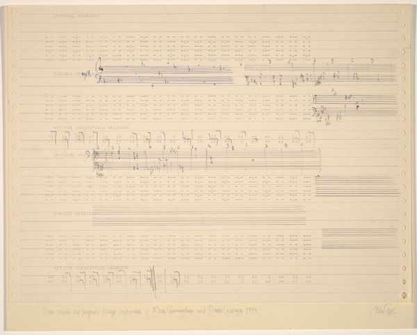
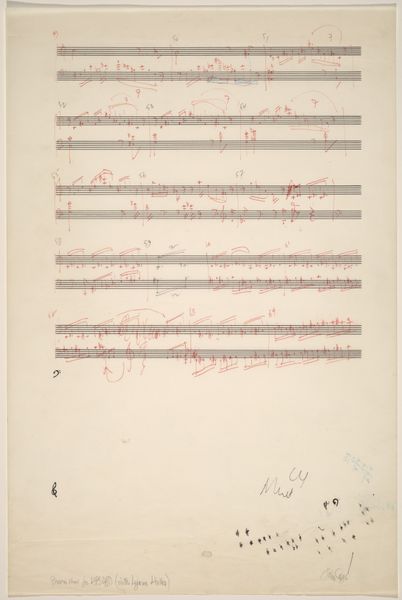
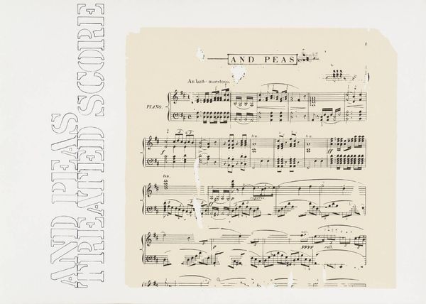
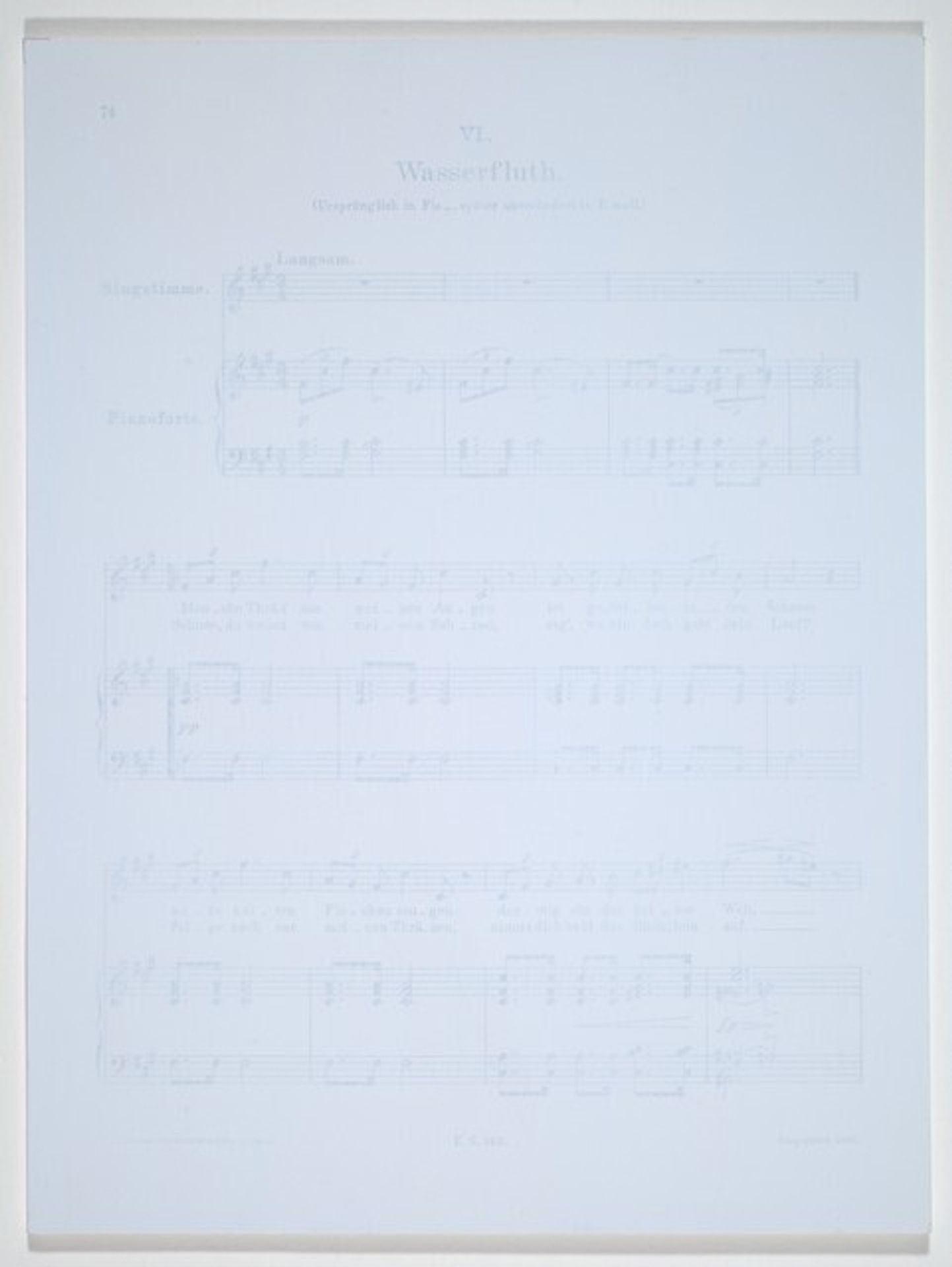
Editor: This is *Winterreise-Wasserfluth* by Tim Rollins and K.O.S., created in 1989. It’s a print featuring musical notation. What I find immediately striking is its ethereal quality, almost ghostly, with its delicate composition. What do you see in this piece? Curator: I see a compelling investigation into the structural elements of visual and musical language. Note how the artists use the existing musical score as a foundation, a rigid framework, then subvert its intended purpose. The faintness of the printed notes invites us to consider the very essence of representation. The tonal variations and the slight "yellowing" adds depth to its pale form. It seems, this challenges the conventional ideas around artistic authorship. How do you react to the artists decision to work in a group? Editor: I see what you mean, its like they're questioning the idea of the singular artistic genius through their collaboration but also in the very subtle manipulation of the base musical text. What meaning do you derive from it? Curator: In terms of semantics, the group dynamic brings forth a sense of collective consciousness. However, aesthetically, I am captivated by the tonal and soft colors used in it. Do you see that this artwork is stripped down to bare bones of visual art- line, tone and texture, devoid of emotional impact? Editor: Now that you mention it, the emotional component feels very subtle, secondary even to the formal composition of lines and shapes on the print. Curator: Exactly. The focus is less on conveying the *content* of the song and more on dissecting the underlying structure and presenting that as its primary subject matter. Through the semiotics and tonal distribution in this work, Rollins and K.O.S. successfully provoke us to consider how much context influences our interpretations, and it shifts based on presentation style. Editor: That’s given me a completely new appreciation for how form dictates our interaction with this piece. Thank you! Curator: It was a pleasure to observe with you. This exploration into the underlying mechanics is what elevates this artwork above a mere copy.
Artwork details
- Medium
- Dimensions
- Image: 302 x 230 mm Sheet: 302 x 230 mm
- Copyright
- National Gallery of Art: CC0 1.0
Tags
Comments
Share your thoughts
About this artwork
Editor: This is *Winterreise-Wasserfluth* by Tim Rollins and K.O.S., created in 1989. It’s a print featuring musical notation. What I find immediately striking is its ethereal quality, almost ghostly, with its delicate composition. What do you see in this piece? Curator: I see a compelling investigation into the structural elements of visual and musical language. Note how the artists use the existing musical score as a foundation, a rigid framework, then subvert its intended purpose. The faintness of the printed notes invites us to consider the very essence of representation. The tonal variations and the slight "yellowing" adds depth to its pale form. It seems, this challenges the conventional ideas around artistic authorship. How do you react to the artists decision to work in a group? Editor: I see what you mean, its like they're questioning the idea of the singular artistic genius through their collaboration but also in the very subtle manipulation of the base musical text. What meaning do you derive from it? Curator: In terms of semantics, the group dynamic brings forth a sense of collective consciousness. However, aesthetically, I am captivated by the tonal and soft colors used in it. Do you see that this artwork is stripped down to bare bones of visual art- line, tone and texture, devoid of emotional impact? Editor: Now that you mention it, the emotional component feels very subtle, secondary even to the formal composition of lines and shapes on the print. Curator: Exactly. The focus is less on conveying the *content* of the song and more on dissecting the underlying structure and presenting that as its primary subject matter. Through the semiotics and tonal distribution in this work, Rollins and K.O.S. successfully provoke us to consider how much context influences our interpretations, and it shifts based on presentation style. Editor: That’s given me a completely new appreciation for how form dictates our interaction with this piece. Thank you! Curator: It was a pleasure to observe with you. This exploration into the underlying mechanics is what elevates this artwork above a mere copy.
Comments
Share your thoughts