About this artwork
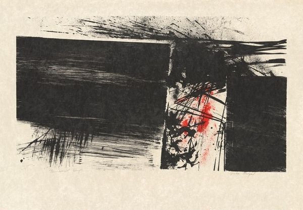
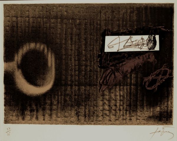
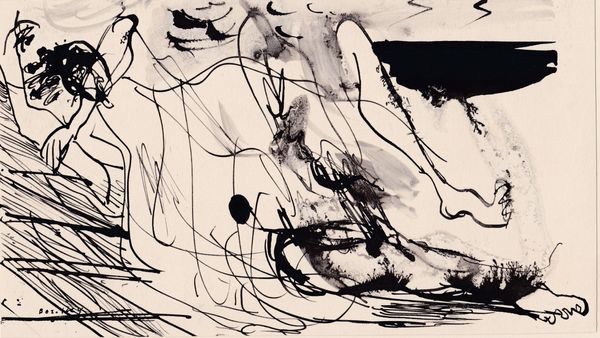
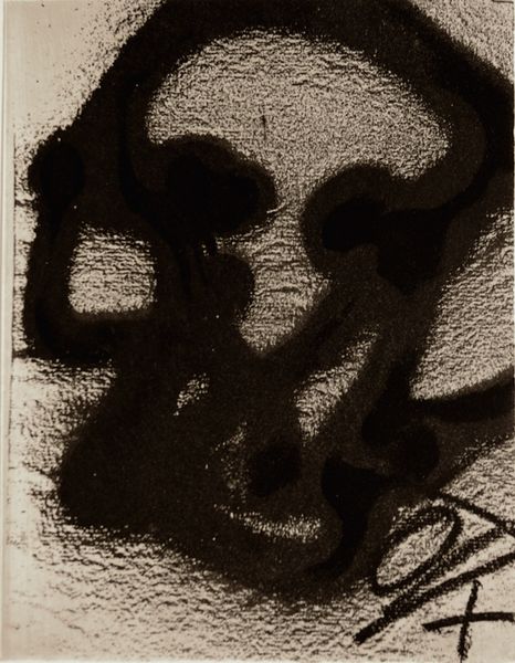
Curator: We’re standing before Antoni Tàpies’s "Divisé" from 1983, a mixed-media drawing utilizing charcoal, among other techniques. What springs to mind when you see this, Editor? Editor: An overwhelming sense of duality, certainly. The stark contrast is arresting – almost aggressive. There’s a feeling of being cleaved, not just visually, but perhaps even psychologically. Like two opposing forces struggling within the same frame. Curator: Exactly, and that's what I find so engaging about Tàpies's approach. It’s not just abstraction for abstraction's sake. The artist utilizes stark contrasts, creating tension and a sense of incompleteness to highlight life's fragmented nature. Editor: I notice the monochrome palette further reinforces that sentiment. The reduction to essentially black and white throws the symbols into sharper relief, focusing on form and essence. Is there a deliberate choice of symbols present? Curator: Absolutely, but deciphering those symbols is the heart of the riddle. I would note the prominent cross figure, especially in the black field on the left side. Editor: Ah yes, embedded within a stark monochrome field! One wonders, then, if it gestures toward spiritual weight, or a form of rebellion – a rejection of conventional forms. Perhaps both. I imagine that many will struggle with interpreting that symbol because, without additional contextual knowledge, they could feel overwhelmed, lost. Curator: Perhaps, but isn’t that the thrill of it? He demands that we bring our own interpretations to the work. The scratches, smudges, even the splatters all contribute to a very visceral, textural experience. There's nothing sterile or pre-packaged about it, much like the "matter painting" movement, for which he is also celebrated. Editor: True. I take the point – it is this rough, tactile quality that seems to give it power and invites a more subjective interpretation, a conversation, almost. Overall, this image of Tàpies presents such visual contrasts. In it, I feel, he creates space for us to reflect on similar stark tensions in our own minds and world. Curator: Precisely, Editor. It's this challenging aspect of Antoni Tàpies’ work, so pregnant with visual tension and raw expressiveness, that, to me, makes it so perversely beautiful.
Artwork details
- Medium
- drawing, mixed-media, charcoal
- Copyright
- Antoni Tapies,Fair Use
Tags
Comments
Share your thoughts
About this artwork
Curator: We’re standing before Antoni Tàpies’s "Divisé" from 1983, a mixed-media drawing utilizing charcoal, among other techniques. What springs to mind when you see this, Editor? Editor: An overwhelming sense of duality, certainly. The stark contrast is arresting – almost aggressive. There’s a feeling of being cleaved, not just visually, but perhaps even psychologically. Like two opposing forces struggling within the same frame. Curator: Exactly, and that's what I find so engaging about Tàpies's approach. It’s not just abstraction for abstraction's sake. The artist utilizes stark contrasts, creating tension and a sense of incompleteness to highlight life's fragmented nature. Editor: I notice the monochrome palette further reinforces that sentiment. The reduction to essentially black and white throws the symbols into sharper relief, focusing on form and essence. Is there a deliberate choice of symbols present? Curator: Absolutely, but deciphering those symbols is the heart of the riddle. I would note the prominent cross figure, especially in the black field on the left side. Editor: Ah yes, embedded within a stark monochrome field! One wonders, then, if it gestures toward spiritual weight, or a form of rebellion – a rejection of conventional forms. Perhaps both. I imagine that many will struggle with interpreting that symbol because, without additional contextual knowledge, they could feel overwhelmed, lost. Curator: Perhaps, but isn’t that the thrill of it? He demands that we bring our own interpretations to the work. The scratches, smudges, even the splatters all contribute to a very visceral, textural experience. There's nothing sterile or pre-packaged about it, much like the "matter painting" movement, for which he is also celebrated. Editor: True. I take the point – it is this rough, tactile quality that seems to give it power and invites a more subjective interpretation, a conversation, almost. Overall, this image of Tàpies presents such visual contrasts. In it, I feel, he creates space for us to reflect on similar stark tensions in our own minds and world. Curator: Precisely, Editor. It's this challenging aspect of Antoni Tàpies’ work, so pregnant with visual tension and raw expressiveness, that, to me, makes it so perversely beautiful.
Comments
Share your thoughts