drawing, print, paper, ink, engraving
#
portrait
#
drawing
# print
#
figuration
#
paper
#
ink
#
italian-renaissance
#
engraving
Dimensions: height 150 mm, width 92 mm
Copyright: Rijks Museum: Open Domain
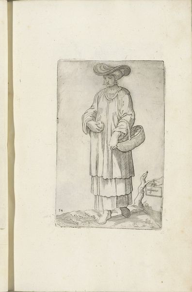
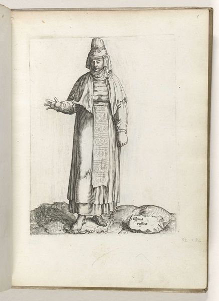
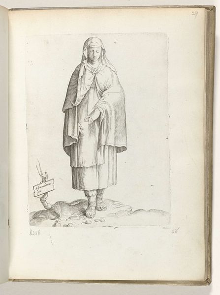
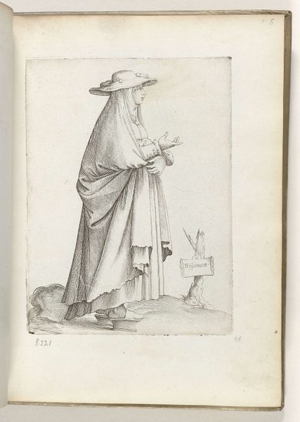
Curator: Let's examine this engraving, Hispaniae, dating from 1558. It’s the work of Enea Vico and is currently held in the Rijksmuseum's collection. Editor: My first thought is that the artist is showing a quiet nobility. The controlled use of line creates delicate textures and shading. There's an overall harmony in its geometric elements; for instance, the round fruit and basket subtly echoing the large circular brim of the hat. Curator: Indeed. Vico was part of a circle keen to document European regional types, almost an early form of ethnography through prints. The figure, adorned in layered fabrics, is "Hispania," a personification of Spain itself. See the small sign nearby at the figure's left side? Editor: I see it. The level of detail, particularly on the garments, is extraordinary, the layering giving form and the eye just doesn't tire of observing them. Curator: It demonstrates Vico's skill at conveying a sense of substance through line alone. But it’s not simply about skillful depiction; it’s also about how Spain, or rather Vico's representation of Spain, wanted to be seen by the wider European audience. Note the serene, controlled air. The prosperity implied by the goods and layered garments. It presents an image of stable plenty. Editor: So much implied texture; it reminds me of the way drapery was explored during this period. A surface of shifting light and shadow that’s also carefully structured, not haphazard. Note also that she’s in three-quarter view and not fully facing the viewer, inviting speculation. Curator: Exactly. Consider the symbolism too. The fruit she holds could allude to the agricultural wealth of Spain, particularly the orchards of its southern regions. The print's intended audience might be expected to connect the items with that geographical locale. Editor: It’s a study of textures, both real and implied. Hard versus soft, heavy versus light, using a visual language accessible and, at the time, modern. Curator: It’s fascinating how such meticulous line work conveys these layers of meaning, both material and symbolic, for audiences of the era. I think we can agree it presents viewers, now as then, a curated window onto a specific moment in European history and self-conception. Editor: Yes, a very balanced and elegant way to make a declaration, restrained but never neutral.
Comments
No comments
Be the first to comment and join the conversation on the ultimate creative platform.
