drawing, ornament, print, relief, ink, engraving, architecture
#
drawing
#
ornament
#
baroque
# print
#
relief
#
figuration
#
form
#
ink
#
arch
#
history-painting
#
engraving
#
architecture
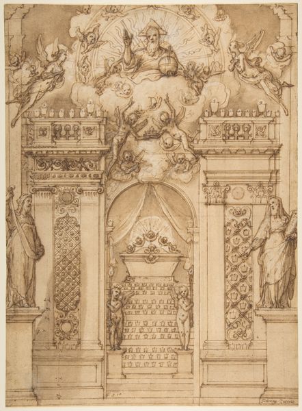
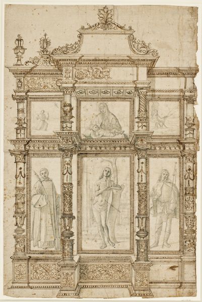
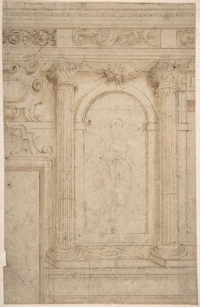
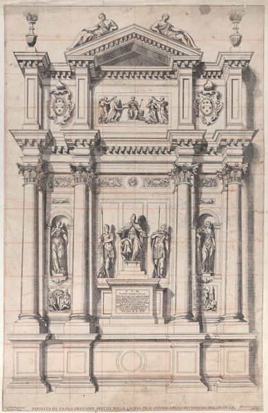
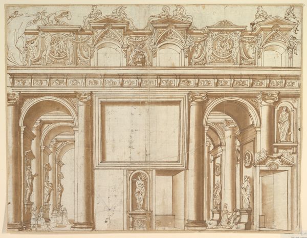
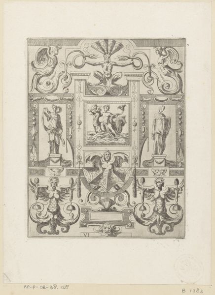
Dimensions: 10 x 14 in (25.5 x 35.4 cm)
Copyright: Public Domain
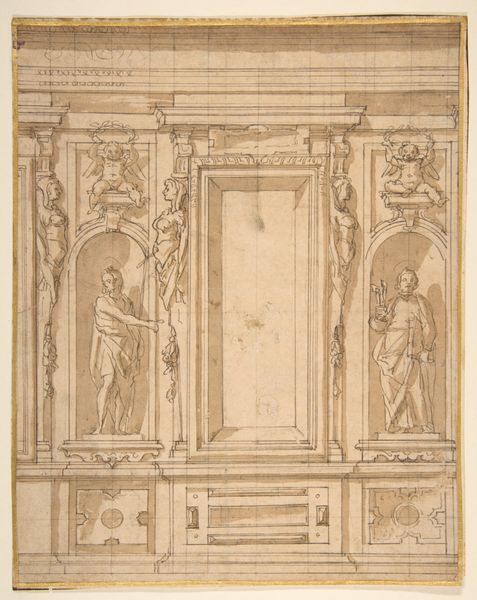
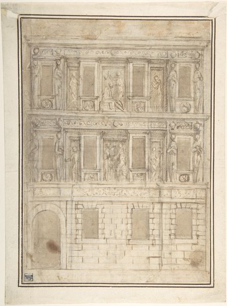
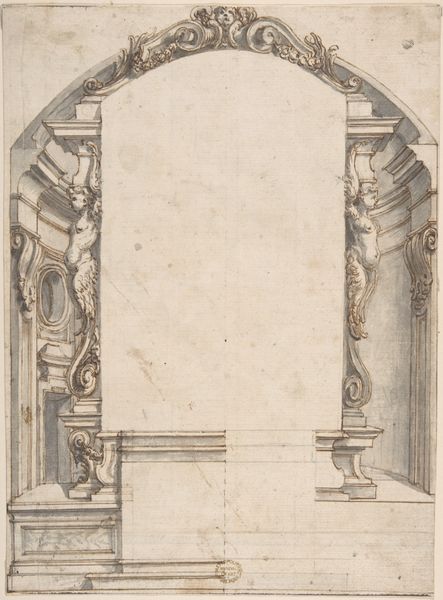
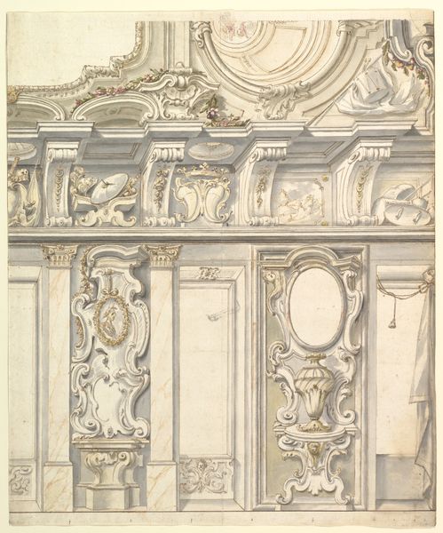
Editor: Here we have "Design for a Façade," an ink and engraving print dating from somewhere in the 18th century. The artist, so far, is anonymous. I'm immediately struck by the balance and symmetry of the piece. The intricate ornamentation makes me wonder how it would function architecturally. What aspects of the composition stand out to you? Curator: I’m drawn to the formal interplay of the flat, almost diagrammatic representation against the illusionistic depth created through hatching and cross-hatching. Consider the structure: the composition divides itself into distinct horizontal registers. Note how the artist utilizes the contrast between smooth, undecorated surfaces and heavily ornamented areas to direct the eye. What effect does this create? Editor: It guides the viewer, highlighting certain elements over others, I guess. Like the figure at the center! It is far more detailed and draws my attention right away. Curator: Precisely. The figure, rendered with more volumetric presence, acts as a focal point. Now, consider the vocabulary of forms - the arches, the scrolls, the cartouches. Each element contributes to a sense of controlled dynamism. Do you perceive a hierarchy within these ornamental forms? Editor: Definitely. Some are much simpler than others. Curator: The design suggests a calculated approach to visual communication, wherein form dictates function and vice versa. In other words, meaning emerges not from explicit symbolism, but through the arrangement and treatment of visual elements themselves. Editor: That makes perfect sense. I initially approached it as a pure representation, but now I see that the real interest is in how the parts relate. Thank you. Curator: Indeed. It demonstrates how much can be gleaned simply from studying intrinsic artistic properties.
Comments
No comments
Be the first to comment and join the conversation on the ultimate creative platform.
More like this