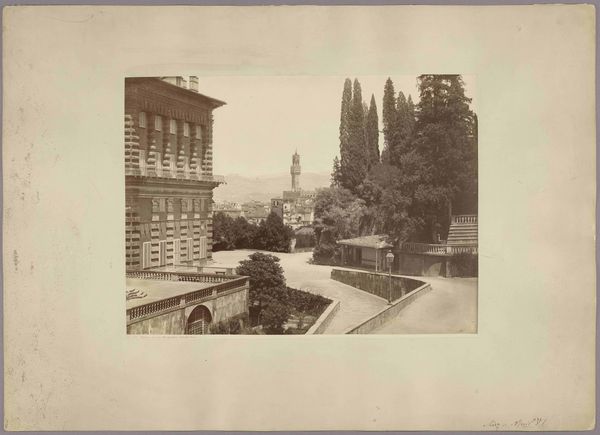
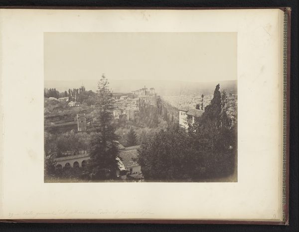
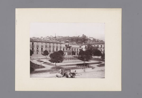
Gezicht op het Palazzo Pitti, de Boboli-tuinen en het Palazzo Vecchio te Florence, Italië 1863 - 1914
giorgiosommer
Rijksmuseum
Dimensions: height 274 mm, width 391 mm
Copyright: Rijks Museum: Open Domain
Curator: Right, let’s dive into this photograph—it’s titled "Gezicht op het Palazzo Pitti, de Boboli-tuinen en het Palazzo Vecchio te Florence, Italië"… quite a mouthful! The work comes to us from Giorgio Sommer, likely taken between 1863 and 1914. Editor: It’s wonderfully atmospheric. Something about the light, that diffused focus...it lends the whole scene a sort of dreamy, nostalgic quality. It feels like looking into the past, literally and figuratively. Curator: Precisely! Sommer’s piece employs the gelatin silver print technique, beautifully capturing this expansive cityscape. Note the Palazzo Pitti dominating the left, transitioning into the verdant Boboli Gardens, and then… glimpse the Palazzo Vecchio in the distant haze. The romantic ideal, wouldn’t you say? Editor: I'd agree, given the sharp contrasts it emphasizes and obscures. That chiaroscuro makes a statement: Look at the rough facade of Pitti – imposing and permanent, almost aggressively there!– and then… oh, Florence is just fading behind it, as if daring anyone to come too close or think too deeply. Curator: I think Sommer plays cleverly with layers here, spatially and emotionally. The strategic framing gives depth; from the detailed architecture upfront, our perspective drifts to this blurry yet identifiable Florence. He emphasizes permanence against the march of time with light. Editor: But even the gardens seem tamed! Not just organic matter, they lead somewhere, into what seems staged. Like nature playing supporting roles of people who can build huge palazzi to remind her where her actual spot it. I read it a touch darker now. A study of human's position and time. Curator: A darker reading adds to its complexities! Sommer’s skill is making it accessible. His "Florence" is no idyllic postcard but a layered commentary. It's a peek into a specific era but speaks across decades—doesn't it feel both grounded and utterly removed from the modern now? Editor: Indeed. I came here expecting light romance, and ended seeing just shadows making pretty shapes around what once held the world captive, so… maybe that says more about my day, then anything, really. Thanks, Florence. Thanks Giorgio.
Comments
No comments
Be the first to comment and join the conversation on the ultimate creative platform.