Dimensions: height 224 mm, width 182 mm
Copyright: Rijks Museum: Open Domain
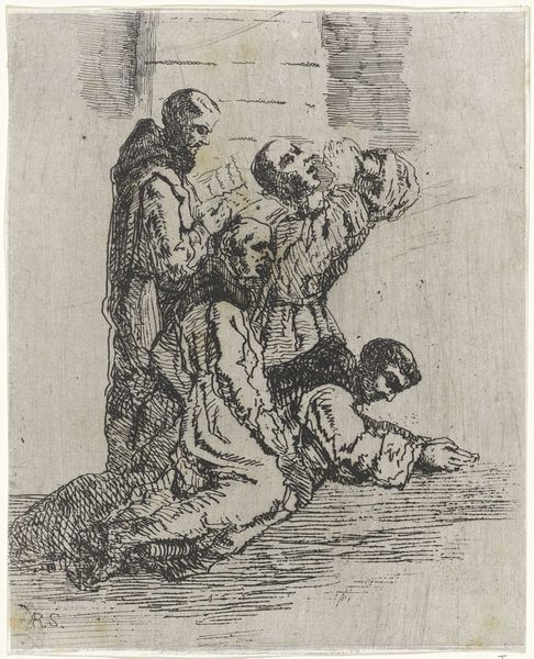
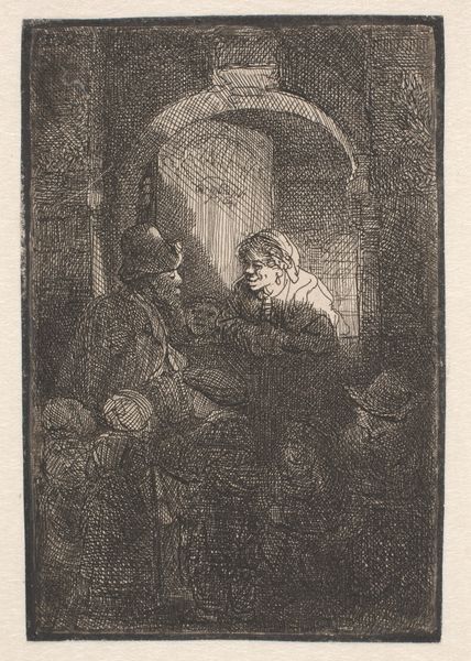
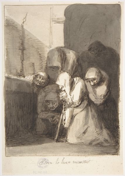
Curator: We are looking at "Monniken in gebed," or "Monks in Prayer," a drawing in ink on paper by Arnoud Schaepkens, likely created sometime between 1831 and 1904. Editor: My immediate sense is one of stark, almost unsettling devotion. The high contrast emphasizes the figures huddled in what seems like a moment of profound religious experience. There is a strong vertical emphasis, created by the figures and a corner column, adding to the claustrophobic impression of a sparsely furnished, austere location. Curator: Indeed. Schaepkens positions these figures carefully. Consider the interplay of light and shadow defining their forms. It adds an almost theatrical element, fitting for the Romantic period to which this work belongs. These sharp contrasts amplify the emotion conveyed in this devotional setting. Editor: Thinking about it in terms of reception, given its likely creation during the Romantic period, I see how this resonates with the era’s preoccupation with intense emotional experiences. But also how faith can function as spectacle, particularly when communicated via institutions like monasteries. Does the piece function as pious tribute or something more critical? Curator: Interesting point. From a formal viewpoint, the lines vary in thickness, creating a rhythm, with certain details carefully etched while others remain vague, suggesting a sense of immediacy. But it might equally reflect Schaepkens' engagement with depicting emotive themes linked with Romanticism in other ways as well – perhaps indirectly reflecting a desire for spiritual experience. Editor: The faces too– particularly the one looking skyward—lend themselves to speculation. Is it sorrow? Longing? It’s hard to know what’s depicted as religious fervor. Considering, too, Schaepkens lived during a period of considerable social and religious change. Did those cultural tensions influence how these monks are presented? Curator: Certainly, one can speculate. What intrigues me is how these lines, and the specific rendering, create a unique tonal atmosphere—almost ethereal, really– making an otherwise austere scene more inviting. The varying application and concentration of ink really lends itself to interpreting mood, but, of course, each viewer's response differs. Editor: Ultimately, Arnoud Schaepkens’ choice to highlight particular segments using stark lighting choices, is an interesting element to read culturally. What societal attitudes toward the religious orders can be traced via this piece? That’s something I find compelling. Curator: Thank you. Examining those very elements – the interplay of material and structure, has helped me grasp the core intention in representing and depicting piety in its historical context. Editor: A fittingly critical synthesis indeed.
Comments
No comments
Be the first to comment and join the conversation on the ultimate creative platform.