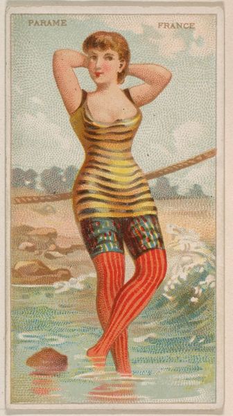
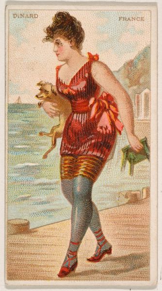
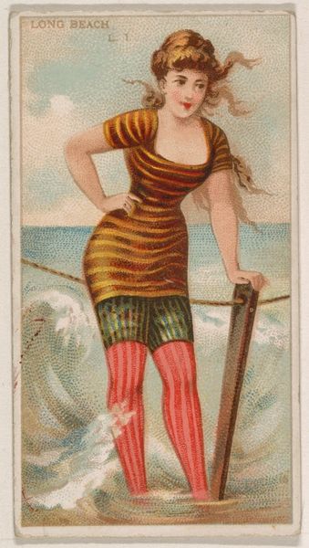
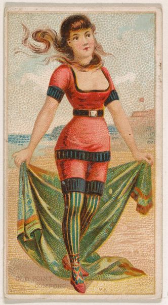
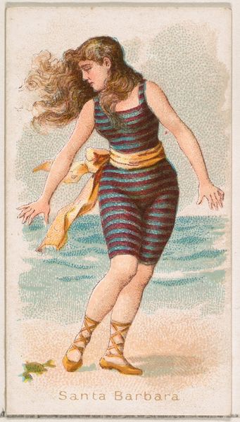
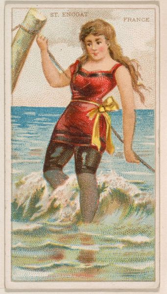
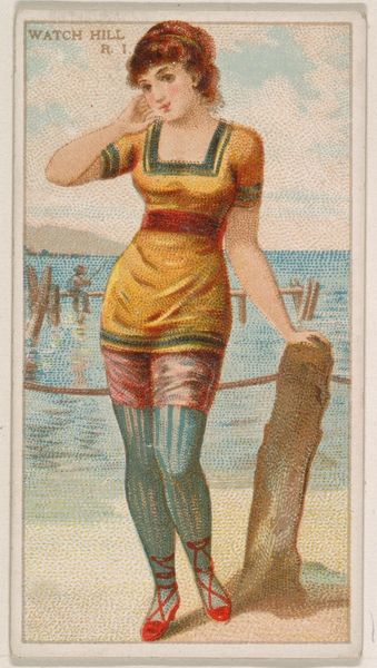
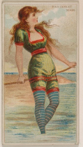
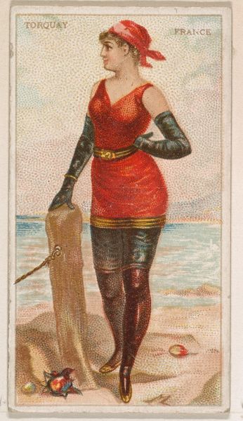
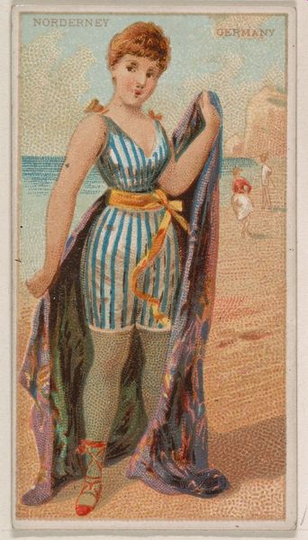
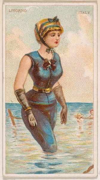
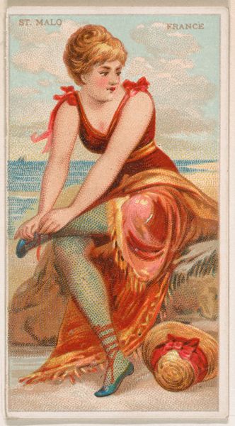
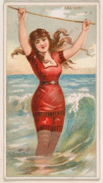
Heligoland, German Coast, from the Surf Beauties series (N232), issued by Kinney Bros. 1889
0:00
0:00
# print
#
figuration
#
coloured pencil
#
watercolour illustration
#
watercolor
Dimensions: Sheet: 2 3/4 × 1 1/2 in. (7 × 3.8 cm)
Copyright: Public Domain
Editor: This is "Heligoland, German Coast, from the Surf Beauties series" printed in 1889 by Kinney Bros. It appears to be a print, maybe a colored drawing originally, and it’s part of a larger series. I am struck by the figure’s stylized pose and the unusual combination of textures; it’s both charming and slightly odd. How do you interpret this work through a Formalist lens? Curator: Indeed, this piece presents a compelling interplay of form. Observe the subject's costume and compare its texture to the water represented, noticing how each of the constituent aspects presents as points and specks. Do you notice any elements from the broader artistic traditions around at the time? Editor: I think I do see some elements of Japonisme in this image and the emphasis on flattened planes and decorative patterns! The colors also feel somewhat muted and harmonious, even the slightly odd choice of colors, especially her green legs. How does that affect your interpretation? Curator: The considered deployment of colour serves as a semiotic system. How do those leg markings impact your overall feeling as to what the picture means? Consider also the flatness of the colour fields compared to the woman. Editor: Her legs almost feel disconnected from the rest of her, or maybe hyperreal. She looks to be having a day at the beach, yet that part almost looks more… uncanny. Is that sort of destabilization the intention here? Curator: Perhaps, and perhaps not only destabilization, but that contrast makes the image more real. Does the flattening make you consider a specific school of art? How does the overall composition contribute to the work’s effectiveness? Editor: Yes! Thinking about Post-Impressionism makes sense. The slightly arbitrary colours, the use of the flattened shapes... It brings everything together. I find myself appreciating the calculated nature of it all! Curator: Precisely. By examining the formal elements—colour, texture, composition—we unveil the aesthetic strategies at play. The tension and flatness guide us away from objective realism and into something more interesting. Editor: Absolutely. I had missed that so much richness could be mined from this unassuming little print! Thanks!
Comments
No comments
Be the first to comment and join the conversation on the ultimate creative platform.
More like this