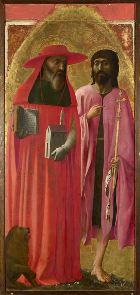
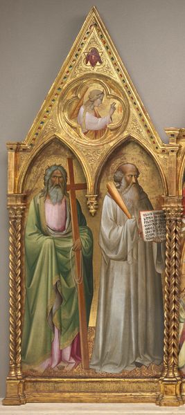
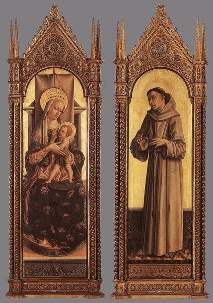
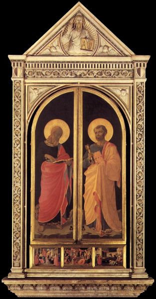
Saints Matthew and Francis 1430 - 1440
tempera, painting, oil-paint
tempera
painting
oil-paint
oil painting
history-painting
italian-renaissance
early-renaissance
portrait art
Dimensions: Overall, with added strips, 54 5/8 x 34 3/4 in. (138.7 x 88.3 cm); painted surface 52 7/8 x 33 1/2 in. (134.3 x 85.1 cm)
Copyright: Public Domain
Editor: This is "Saints Matthew and Francis" by Giovanni di Paolo, dating from 1430 to 1440, painted with tempera and oil. I’m immediately drawn to the juxtaposition of colors and textures. What strikes you most about the formal qualities of this work? Curator: Note the emphasis on line and shape. The figures are defined by strong, elegant lines, yet there's a flatness inherent in the early Renaissance style. Consider the drapery. The folds, while attempting to create volume, are more decorative, linear patterns on the surface. Also, what is your impression of the use of gold? Editor: The gold leaf background is striking, but it also flattens the space, which creates an interesting contrast with the attempt at depth in the figures' robes. Is it fair to see this contrast as central to this work? Curator: It's key to understanding the aesthetic of the Early Renaissance. The artist is working with contradictory pictorial conventions. We have a simultaneous embrace of the Byzantine tradition through the gold, with a burgeoning interest in a more naturalistic representation of form. This tension creates a unique visual experience, doesn't it? What about the positioning of the two saints? Editor: They seem deliberately posed, almost like geometric forms placed side-by-side. The colors also stand out—the blues and reds of their books, against the neutral drapery, makes the piece more visually appealing. Curator: Precisely. Notice the restricted palette and the carefully balanced composition. The placement of color is not merely decorative; it creates a visual harmony, a kind of order within the symbolic representation. Do you observe how each figure’s garment colour complements the others against the tooled gilded ground? Editor: I hadn't considered that, but now I do see how those subtle colour choices really contribute to the visual balance. I’m realizing now, this piece isn't just about religious figures, but it's also about this moment of figuring out painting! Curator: Indeed. And this is achieved precisely through the relationships and dialogue between line, colour, shape and material; by experiencing this relationship visually we, too, are rewarded by its structural resolution.
Comments
No comments
Be the first to comment and join the conversation on the ultimate creative platform.