Copyright: CC0 1.0
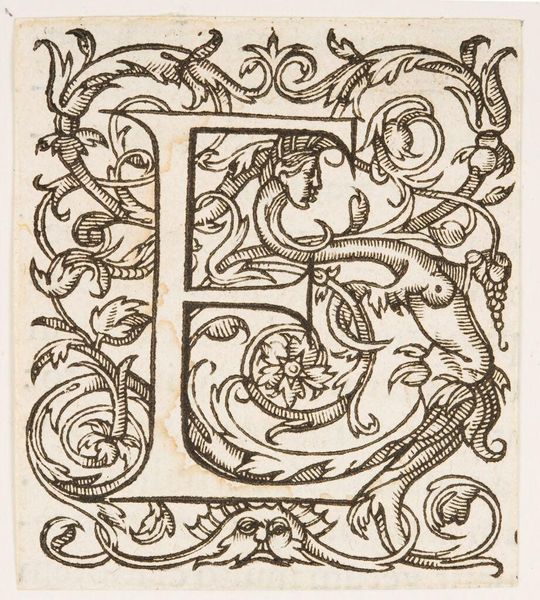
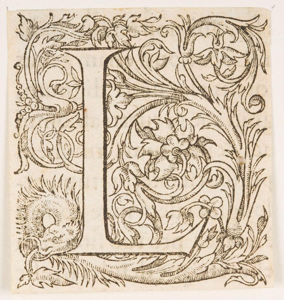
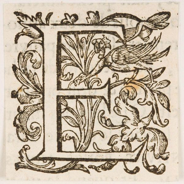
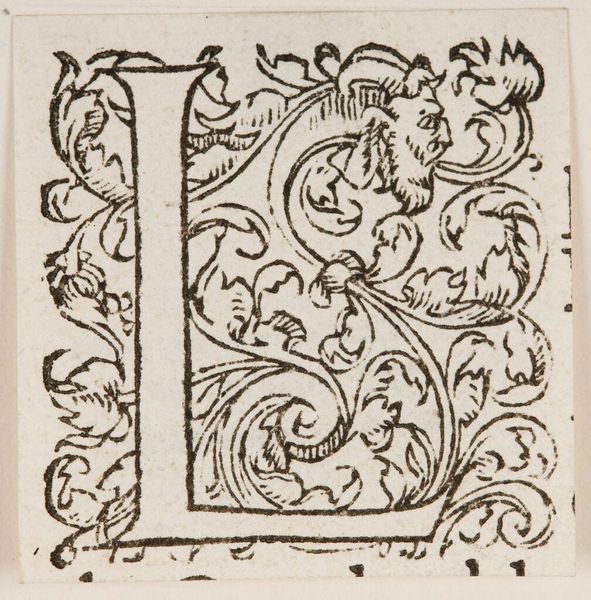
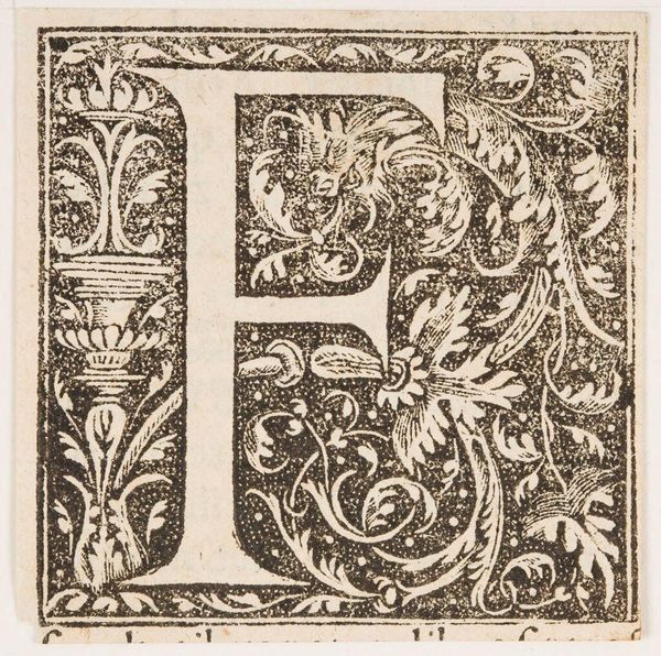
Curator: Here we have "Letter E," an intriguing woodcut initial from an anonymous artist. There's a wonderful density to the mark-making. Editor: It feels both formal and wild, doesn't it? The letter itself is so structured, yet it's engulfed in these organic, almost chaotic swirls of foliage and a small animal form. Curator: Exactly. Initials like this were often used to mark the beginnings of chapters or important passages in early printed books. They added visual interest but also signaled hierarchy. Editor: And the inclusion of the animal figure – is that symbolic, or simply decorative? How might this tiny dragon or wolf reflect contemporary beliefs about the written word? Curator: That’s the exciting part, isn’t it? The absence of an artist’s name invites us to interpret the work through its cultural function and speculate on the meaning of the elements. Editor: For me, it's a reminder that even seemingly simple designs carry layers of intention and social meaning. Curator: Absolutely, a small piece holding huge narratives.
Comments
No comments
Be the first to comment and join the conversation on the ultimate creative platform.
More like this