Dimensions: height 412 mm, width 278 mm
Copyright: Rijks Museum: Open Domain
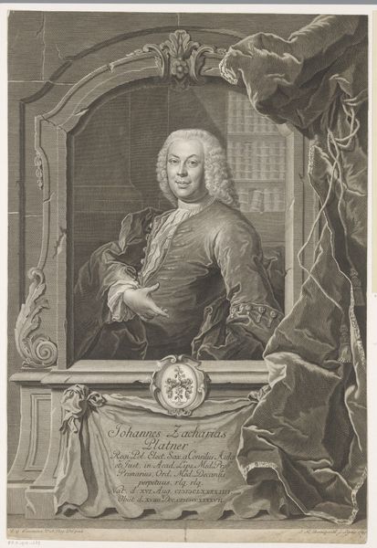
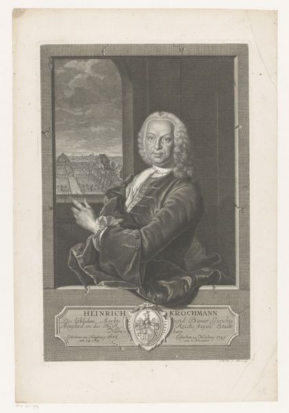
Editor: Here we have Johann Elias Haid’s "Portret van Gabriel Spitzel," made sometime between 1760 and 1809. It’s an engraving currently held at the Rijksmuseum. I find the subject's gaze quite arresting, and the composition, framed by this faux window, is very interesting. What do you see in this piece, especially considering the artist's choices regarding form? Curator: The image presents a fascinating interplay of textures and implied forms through line work. Note how Haid contrasts the smooth, almost porcelain-like, quality of Spitzel's face with the rich, varied textures of the fur and fabrics. Semiotically, the window frame operates as a structural device, simultaneously containing and presenting the subject. It draws our eye and controls the boundaries of the pictorial space. Consider the layering of the image and how each element plays against another. Editor: So, you are pointing at how the visual contrast heightens the dramatic effect. The soft textures seem more delicate by being right next to that hard stone frame! What about that shadowy figure in the background? Curator: Precisely! The secondary figure, emerging from the darkness, could signify multiple meanings in structural analysis. It introduces depth, mystery and perhaps even alludes to another level of the artist's identity and intention. Is it his patron, his past self, or something more symbolic? I think the very presence disrupts a typical portrait; creating internal contrasts enhances the meaning and gives the artist something deeper to show the viewer. It breaks that barrier and shows that the engraving goes past traditional means. The use of Chiaroscuro draws our eye, and contrasts light to dark to define form in ways that add symbolic weight. How does this tension between light and shadow inform the viewer, in your eyes? Editor: I hadn’t thought of it that way! That really deepens the piece, going beyond just representation. Now I'm starting to look at the structure and technique first, thinking about what the contrasts create! Curator: Indeed! It’s in these formal tensions where we can really unpack the work’s complexities. Analyzing these relationships shows why the portrait lives up to the standard, despite not even using any color to enhance it.
Comments
No comments
Be the first to comment and join the conversation on the ultimate creative platform.
More like this