drawing, print, gouache, paper, ink, chalk, graphite, pen, charcoal
#
drawing
#
narrative-art
#
baroque
# print
#
gouache
#
charcoal drawing
#
figuration
#
paper
#
ink
#
chalk
#
graphite
#
pen
#
charcoal
#
history-painting
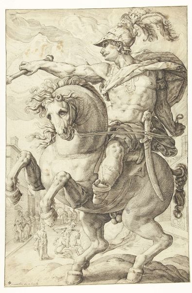
Dimensions: 241 × 195 mm
Copyright: Public Domain
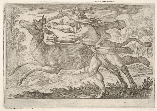
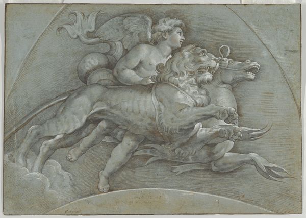
Editor: Here we have Balthasar Permoser's "Combat Between Horseman and Footsoldier," made sometime in the 17th or 18th century using pen, ink, chalk, graphite, gouache, and charcoal on paper. It strikes me as very dynamic; the composition is almost bursting with energy, despite being a relatively simple sketch. What catches your eye about this piece? Curator: Formally, I am struck by the sophisticated interplay of positive and negative space. Notice how the artist utilizes the toned ground of the paper, allowing it to define the forms as much as the drawn lines themselves. Observe the curvilinear lines, typical of the Baroque, that describe the figures' anatomy, particularly the horse's musculature. Editor: It’s interesting you point that out, the sort of controlled chaos almost! Could you say more about how the materials themselves contribute? Curator: Certainly. The combination of pen and ink for sharp contours, juxtaposed with the softer, more diffused effects of chalk and charcoal, creates a rich surface. It is an aesthetic game where precision meets diffusion; lines versus masses, shadow and light. The use of gouache adds highlights and depth to selected forms, elevating and drawing the eye, making for a visually striking tension within the work. Have you observed where and why gouache is used specifically? Editor: I see what you mean. It’s particularly effective on the horse, and really emphasizes its power in relation to the footsoldier below. The contrast adds real drama to the scene. Thank you, I’ve never quite thought of negative space as a deliberate tool in this way! Curator: Precisely, that compositional contrast is one key strength to admire. You will notice it again and again now.
Comments
No comments
Be the first to comment and join the conversation on the ultimate creative platform.
More like this