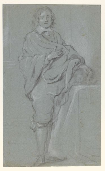
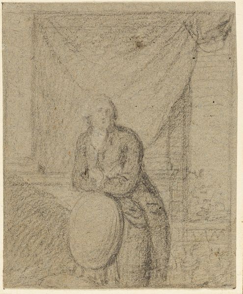
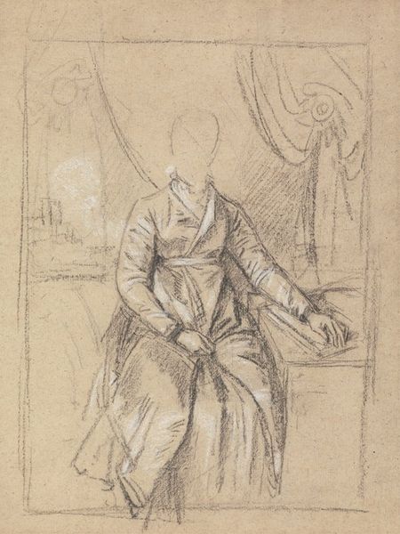
drawing, ink, pen
#
portrait
#
drawing
#
baroque
#
pencil sketch
#
charcoal drawing
#
figuration
#
ink
#
pencil drawing
#
line
#
pen
#
genre-painting
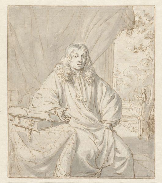
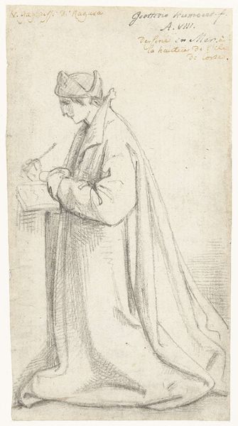
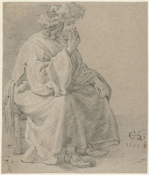
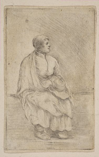
Dimensions: height 159 mm, width 117 mm
Copyright: Rijks Museum: Open Domain
Editor: Here we have Pieter Fransz. de Grebber's "Zittende geestelijke," created sometime between 1610 and 1655. It’s an ink and pen drawing, giving it this delicate, almost ghostly appearance. The lines are so fine, yet they define this seated clergyman. What do you see in terms of its structural composition? Curator: The piece is compelling because of its inherent tension between line and form. Observe how the hatching creates both depth and ambiguity. The overall form relies heavily on contour, but note where the artist allows the line to dissolve, creating a visual vibration. How do you feel the artist used line quality here? Editor: It’s interesting, some lines are much darker and defined. Others, like those in the background, are so light they almost disappear. It creates a sense of depth, I think, but also a kind of unease. Curator: Precisely. The artist uses contrasting densities of line to direct the viewer’s eye and suggest spatial recession. Let's consider the relationship between the figure and the implied volume created by this use of light and dark. Do you notice any disruptions or anomalies in the rendering of space? Editor: I do. The desk seems a little flat compared to the figure, and the ground seems a bit undefined; the perspective is... not quite right? Curator: Precisely. The slightly skewed perspective emphasizes the two-dimensionality of the drawing itself, preventing the scene from becoming too illusionistic. By intentionally disrupting the spatial logic, de Grebber draws attention to the artifice of representation. This strategy shifts focus toward the internal construction of the piece rather than external reference. Editor: I see! It's about the *drawing* being a drawing, and less about representing a scene perfectly. Curator: Exactly. The power of this piece resides in its engagement with form and materiality; by examining its parts closely, we appreciate the artist’s calculated use of visual language. Editor: Thanks! I appreciate that way of considering art. I'm learning so much about breaking art down to its elements!
Comments
No comments
Be the first to comment and join the conversation on the ultimate creative platform.
More like this