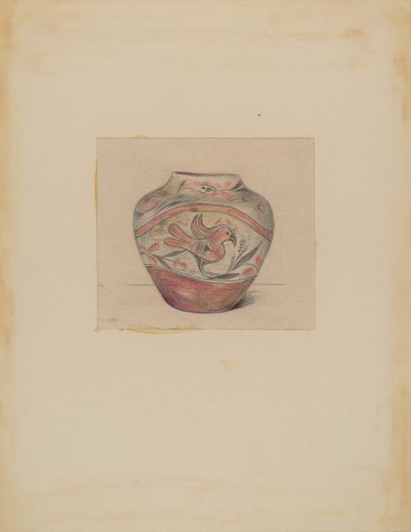
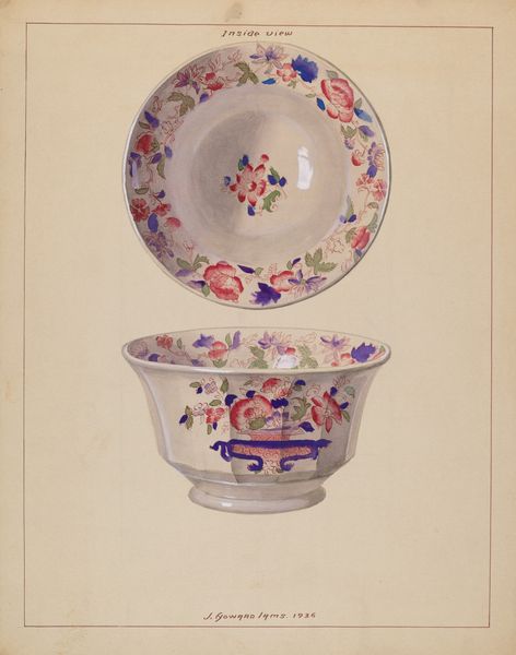
drawing, ceramic, ink
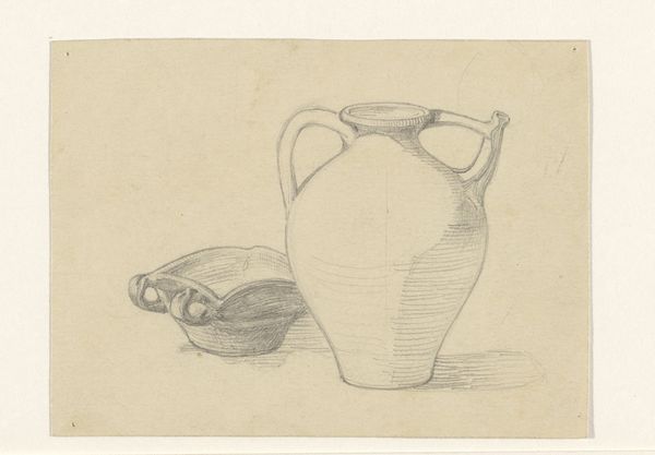
drawing
light pencil work
quirky sketch
pen sketch
asian-art
old engraving style
ceramic
personal sketchbook
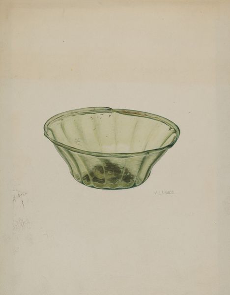
ink
ink drawing experimentation
pen-ink sketch
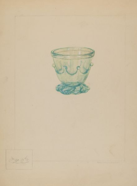
ink colored
line
sketchbook drawing
decorative-art
sketchbook art
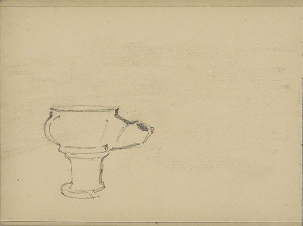
Dimensions: height 200 mm, width 165 mm
Copyright: Rijks Museum: Open Domain
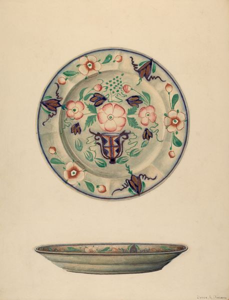
Curator: At the Rijksmuseum, we have a pen and ink drawing by Theo Nieuwenhuis titled "Zeventiende eeuws Perzisch kommetje," created sometime between 1876 and 1951. Editor: It looks like a quick sketch, almost an idle doodle. But even in its simplicity, there’s a certain elegance to the way the light plays on the curved surface. Curator: Indeed. What's interesting here is Nieuwenhuis's clear focus on a mass-produced object. He isolates and elevates it through drawing, granting it a renewed aura divorced from its possible past as merely tableware. The labor involved in crafting the original ceramic piece, probably a fairly ubiquitous item, gets a second life, re-interpreted through his hand. Editor: I'm drawn to the economy of line. Look at how few strokes he uses to suggest volume and texture. The floral pattern, rather abstracted, is captured with remarkable precision. I like how the bold, almost graphic quality created by the shading, emphasizes the bowl’s symmetry and the delicate balance of its form. Curator: Consider the likely consumption of such objects within the domestic sphere of 17th-century Persia and then consider Nieuwenhuis's intervention of that product through a second phase of material practice, of mark-making. What meaning and class distinction did the item have in its era versus what the artist is subtly pointing to now? It shifts the emphasis from purely aesthetic admiration to contemplating labor. Editor: I see your point. But, to me, the hatching, the weight of the lines themselves, create a pleasing rhythm. There's a clear visual structure. And there's no missing how those stylistic qualities add something that elevates the subject past utilitarian origins. Curator: Perhaps Nieuwenhuis aimed to bridge that gap, to expose the beautiful in the mundane. Editor: Exactly. An exercise in line, form, and visual storytelling, regardless of its production origin. Curator: Fascinating to see the piece under new lights, then, isn't it? Editor: Yes, it really is.
Comments
No comments
Be the first to comment and join the conversation on the ultimate creative platform.
More like this