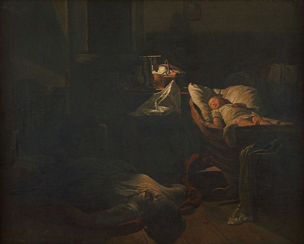
Dimensions: 61.5 cm (height) x 79 cm (width) (Netto)
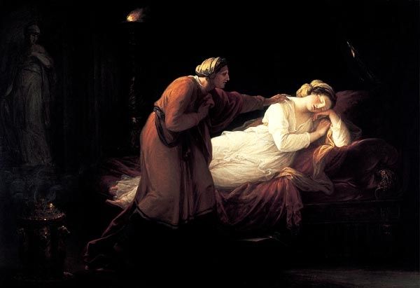
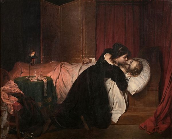
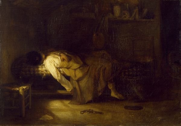
Editor: This is "En tilgivelse," or "A Forgiveness," painted in 1892 by Valdemar Irminger, using oil on canvas. It's quite a somber scene, isn’t it? The subdued palette and the man kneeling in what seems like repentance... How would you interpret this work, focusing on its formal elements? Curator: Precisely. Let us examine the intrinsic properties. Note the stark contrast between the luminous white of the bedding and the figure in dark attire. This dichotomy establishes a clear visual hierarchy, directing our gaze and influencing how we experience the subjects in relation to each other. Does this division strike you as deliberate? Editor: It certainly does. The woman, bathed in light, appears almost ethereal, while the kneeling figure is cloaked in shadow. Curator: Indeed. Consider then, the diagonal composition, running from the upper left to the lower right. This compositional arrangement serves to guide the eye, creating a dynamic tension between the figures and across the plane, rather than implying a single interpretation based upon a reading of any supposed 'narrative'. Does the orientation impact your reading of the painting's subject? Editor: Now that you mention it, yes. The downward slope really emphasizes the man's position and... her seeming powerlessness in the bed. Almost as though they’re physically being separated in a sort of hierarchy... Is the visual weight of his darkness causing the effect? Curator: That could be argued. In viewing, observe how Irminger articulates form through the texture of paint itself. Look closely; can you trace his method, his movements of impasto or layering or juxtaposition of colour and tone? That attention to medium reveals to me not a representation of narrative but an assertion of it. What has stood out for you, thus far, beyond a sense of drama in the painting? Editor: Looking closely, the contrast is heightened more when you consider texture and tone, rather than just a stark color scheme. It definitely makes it easier to view, with one focal area, instead of wondering what’s happening in all parts of the painting. Curator: A very succinct summarization. That, in my estimation, illustrates how, rather than representing 'forgiveness,' we find it invoked, expressed in a pictorial grammar entirely self-contained. Editor: It’s like the artwork isn't just showing us something, but actively trying to get a feeling across with the structure alone. Thanks so much.
Comments
No comments
Be the first to comment and join the conversation on the ultimate creative platform.
More like this