drawing, pencil
#
pencil drawn
#
drawing
#
pencil
#
realism
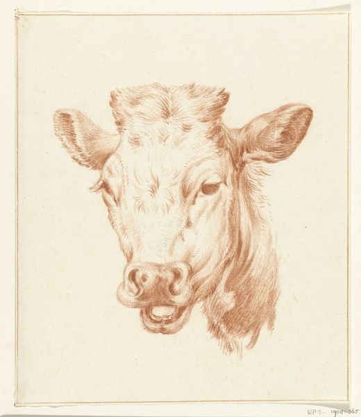
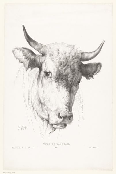
Dimensions: height 53 mm, width 57 mm
Copyright: Rijks Museum: Open Domain
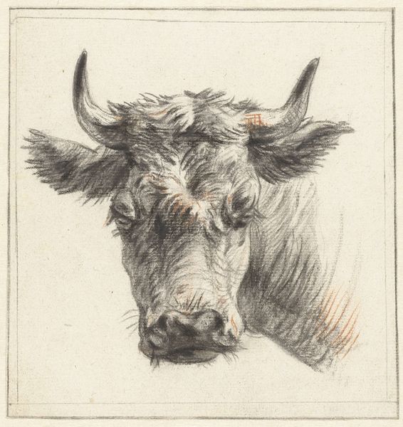
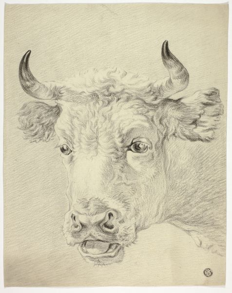
Editor: This is "Kalfskop," a pencil drawing from sometime between 1775 and 1851, by Pieter Janson. I find it striking how he’s captured the weight of the animal’s head simply through tonal variation. What aspects of this piece do you find most compelling? Curator: I am most struck by the artist’s deliberate use of line and shading to create form and texture. Consider the economy of the pencil strokes – the artist uses a relatively limited range of marks to evoke the soft fur and solid bone structure of the calf’s head. Do you notice how the subtle variations in pressure articulate the contours? Editor: Yes, I see that now, especially around the snout and ears. It’s incredible how the artist manages to create such a three-dimensional effect with just a pencil. It seems almost photorealistic, but of course photography wasn’t developed yet. Curator: Indeed. Pay close attention to the strategic employment of chiaroscuro. The contrasting light and dark areas sculpt the head, giving it depth and presence. It moves beyond simple representation to capture the essence of volume. What do you make of the composition itself? Editor: It's a very simple composition, really. Just the head, centered and filling the frame. Maybe that simplicity is what makes it so powerful; there's nothing to distract you from the animal's features. The work becomes all about the gradations of tone. Curator: Precisely. The framing directs the viewer’s eye to engage in an exercise of form. Editor: I never thought of it that way before! Thanks to your analysis, I see beyond the representational aspect of this drawing. It is actually more about line and shadow. Curator: An artwork's components shape meaning beyond the immediately obvious, wouldn't you agree?
Comments
No comments
Be the first to comment and join the conversation on the ultimate creative platform.
More like this