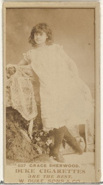
Card Number 514, Miss Clement, from the Actors and Actresses series (N145-7) issued by Duke Sons & Co. to promote Duke Cigarettes 1880s
0:00
0:00
drawing, print
#
portrait
#
drawing
#
toned paper
#
light pencil work
# print
#
pencil sketch
#
charcoal drawing
#
possibly oil pastel
#
charcoal art
#
coloured pencil
#
underpainting
#
men
#
watercolour illustration
#
watercolor
Dimensions: Sheet: 2 11/16 × 1 3/8 in. (6.8 × 3.5 cm)
Copyright: Public Domain
Editor: Here we have “Card Number 514, Miss Clement” from the Actors and Actresses series made by W. Duke, Sons & Co. in the 1880s. It's a print. There's something intriguing about the pose; it feels both staged and somehow a bit vulnerable. What stands out to you, looking at this image? Curator: Primarily, I note the intricate use of line and form. Consider the balance achieved within the constraints of the card format. The figure of Miss Clement, rendered in delicate pencil work, is strategically positioned to create a visually compelling composition. Note the tonal variations in the paper, skillfully used to define the figure and establish depth. How does this interplay of line and tone contribute to the overall impact, in your opinion? Editor: I see what you mean about the composition, and I see what I'd consider some lighter and darker lines to give depth. So, from a formalist point of view, the fact that it was an advertisement is not something we need to concern ourselves with? Curator: Precisely. While the card functions as advertisement, my focus remains on its intrinsic artistic qualities. Observe how the textures – the smooth expanse of her dress, contrasted with the hatched background suggestive of waves – generate visual interest. Can you see the semiotic implications embedded within these stylistic choices? How does the artist communicate depth through material and form? Editor: I think so. It gives the piece a tactile quality despite its small size and the limitations of the print medium. I guess thinking about the tension and relationship between all these artistic elements gives me a new appreciation. Curator: Indeed. By examining the visual language employed, we unlock a deeper appreciation for the artistry at play, irrespective of its commercial origins. I find my eye being pulled in by these types of artistic renderings in mass production!
Comments
No comments
Be the first to comment and join the conversation on the ultimate creative platform.
More like this