#
comic strip sketch
#
mechanical pen drawing
#
pen illustration
#
pen sketch
#
junji ito style
#
personal sketchbook
#
sketchwork
#
pen-ink sketch
#
pen work
#
sketchbook drawing
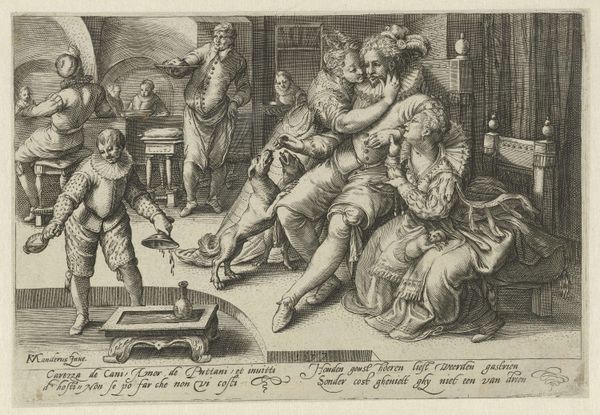
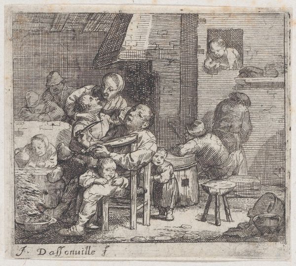
Dimensions: height 98 mm, width 138 mm
Copyright: Rijks Museum: Open Domain
Editor: So, this is "Painter with Model in his Studio" by Jacob van der Heyden, created in 1608. It’s a pen and ink drawing, full of intricate details. What I find immediately striking is the staged quality – everyone seems very consciously positioned. How do you interpret this composition? Curator: What strikes me first is the structured organization of the composition, delineating a clear foreground, middle ground, and background. Van der Heyden carefully orchestrates the pictorial space through linear perspective, drawing the eye deeper into the studio setting. Observe the balanced distribution of figures; each is rendered with distinct attention to their relative positions within the framed image, which gives them an equilibrium with other structural components. Are you observing the orthogonals of the space and their convergence? Editor: Yes, I see that. The lines of the floor and shelves create depth and lead us to the doorway. But doesn't that tight framing also flatten the figures? They feel less three-dimensional and more like graphic elements, which is somewhat strange to me, despite the receding perspective. Curator: Precisely. That perceived flatness introduces a critical tension—the calculated depth versus a flattened pictorial field. It is through the inter-play between orthogonal projection, figural positioning and distribution within this compositional architecture that a structured image emerges. It invites a close reading of space as a construct of organization. Do you perceive how the inscription underscores the structured arrangement within this plane? Editor: I didn’t initially, but I see it now! The text feels integrated. It seems like a conscious choice to make the inscription an intentional compositional feature. It’s really intriguing. Curator: Indeed. Close inspection of the elements makes the intent quite clear. Editor: Thanks for guiding me! I’ve definitely noticed so many more details now. Curator: My pleasure. A formalist reading of art sharpens the eye and elevates our appreciation.
Comments
No comments
Be the first to comment and join the conversation on the ultimate creative platform.
More like this