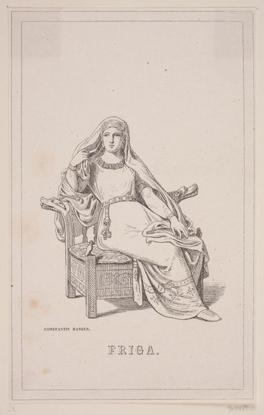
Balder. Illustration til Fabricius' Danmarks historie 1, 119. 1854
0:00
0:00
Dimensions: 203 mm (height) x 127 mm (width) (bladmaal)
Editor: This is "Balder. Illustration til Fabricius' Danmarks historie 1, 119." by H.C. Henneberg, a woodcut from 1854. I'm struck by how the artist uses very simple lines to evoke a sense of solemnity. It’s like a classical statue translated into a very precise graphic language. What stands out to you when you look at the work? Curator: The most prominent element is certainly the figure's posture and the linear quality which produces that classicizing form. Notice the artist's deployment of shadow to model form while maintaining an essentially planar, graphic effect, one produced by very decisive marks. How might you characterize the overall effect? Editor: It’s like the artist tried to find a balance between two-dimensional design and creating depth through line work and strategic shading, resulting in a restrained aesthetic. Curator: Indeed, that interplay is key. Note the deliberate contrast created by the parallel strokes delineating the figure's drapery against the stark, empty background. This contrast emphasizes form, but what does it do for the feeling that you get? Editor: The combination gives it an austere, perhaps even a distanced tone. It’s not overly emotional, despite depicting a mythological figure. It relies almost entirely on clean, precise line to generate what emotive effect it possesses. Curator: Precisely. We can see here how a visual system constructs meaning and how carefully the formal vocabulary must be applied to achieve its unique result. I'd say this exercise has sharpened my reading of prints considerably.
Comments
No comments
Be the first to comment and join the conversation on the ultimate creative platform.
More like this