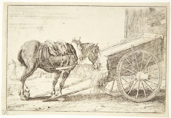
print, etching
#
animal
#
dutch-golden-age
# print
#
etching
#
landscape
#
genre-painting
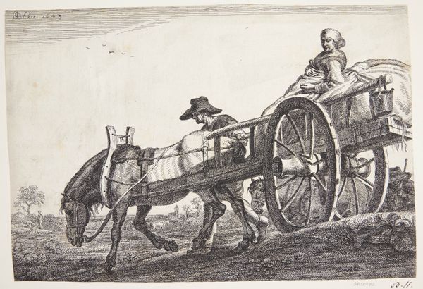
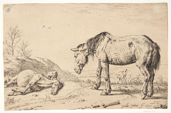
Dimensions: 100 mm (height) x 158 mm (width) (plademaal)
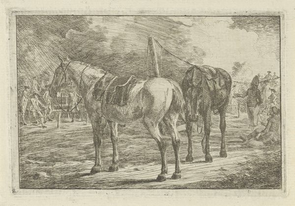
Editor: This print is entitled "To Æsler", which I understand to mean "Two Donkeys," by Jan van den Hecke I, dating from between 1619 and 1684. It's a fascinating composition made from etching, currently residing in the Statens Museum for Kunst. I find it very captivating, it really strikes me how simple it is. How do you interpret this work from a more structural perspective? Curator: Thank you for the introduction. As a formalist, the subject matter here interests me far less than the organization of form within the picture plane. Observe how the strong diagonal created by the posture of the rearmost donkey echoes in the shadows cast across the rough ground. It serves to fracture the composition in a way that is then reinforced by the dog on the other side. Note that a relationship like that suggests an internal framework. How else might you parse that structure? Editor: The verticality of the wooden structure to the left. It counters the movement created by the implied sound of the donkey call. I suppose that visual stability anchors the dynamism of the piece. Curator: Precisely. Consider also the textures achieved by the etching process itself. The artist uses hatching and cross-hatching to create a range of tonal values, even in the monochrome palette. It enhances the tactile qualities of fur, wood, and earth. Notice too, how those dense areas draw our eyes. Are there other elements in its formal vocabulary that particularly speak to you? Editor: Definitely the birds that seem to float between the donkeys' heads and create further dynamism and depth. I find it intriguing how much visual complexity he achieves with such minimal means. Curator: I agree completely. The success of this piece resides not in its representational accuracy, but in the sophisticated arrangement of line, form, and texture that results in the arresting depth that it embodies. A strong manipulation of form truly strengthens the art. Editor: Absolutely. Thinking about those compositional choices, it feels like a lesson in visual grammar, even if, perhaps, inadvertently.
Comments
No comments
Be the first to comment and join the conversation on the ultimate creative platform.
More like this