painting, print, watercolor, engraving
#
water colours
#
baroque
#
painting
# print
#
landscape
#
watercolor
#
cityscape
#
watercolour illustration
#
academic-art
#
engraving
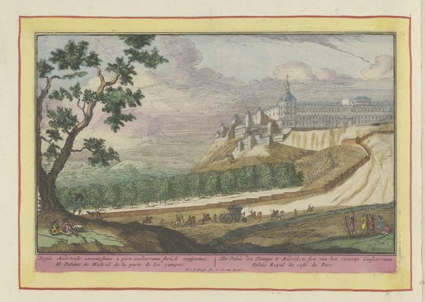
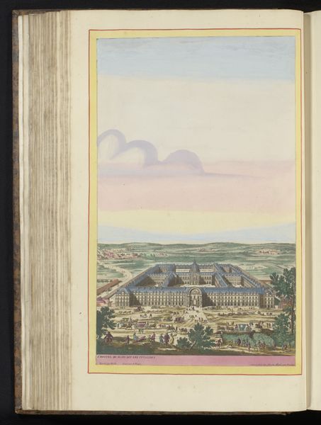
Dimensions: height 170 mm, width 256 mm
Copyright: Rijks Museum: Open Domain
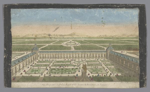
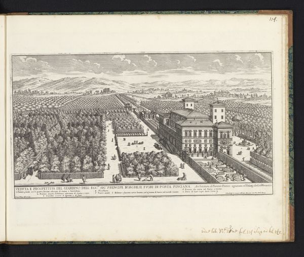
Curator: The Rijksmuseum presents to you “Gezicht op het Paleis van Karel V te Granada,” a Baroque landscape by Pieter van den Berge, dating back to the late 17th or early 18th century. Editor: The scale is interesting, isn't it? The architecture of the palace looms against that immense backdrop of the hill, creating an almost surreal monumentality, yet it's a delicate rendering using watercolor and engraving techniques. It feels paradoxical. Curator: Absolutely, there is tension in the work’s contrasting elements. Van den Berge meticulously renders the facade and the adjacent buildings with fine engraving techniques. Considering his materials – print, watercolor and engraving – we begin to understand its historical value within print culture. It could function as both a decorative object and as a method to circulate knowledge of a place across Europe. Editor: The materiality definitely speaks to its context. The watercolor lends it an ethereal quality, while the precise engraving emphasizes the geometric forms and ideal proportions that embody Baroque classicism. What of the human element, though? The tiny figures populating the foreground serve to exaggerate the palace's scale. Curator: They animate the space, imbuing it with a sense of lived experience while solidifying the central symbolic meaning. It reflects not only a structure, but power and imperial vision embedded within architectural form. Editor: I find myself thinking about what choices underpinned Van den Berge's representation. Was there some kind of commentary being made through the scale discrepancies and the almost manufactured idealisation of nature, and how can our understanding of art production shape that response? Curator: Those artistic choices can underscore both imperial grandeur and the landscape's raw power in the Baroque aesthetic language. The strategic integration of meticulous detail is intended to stir emotions and project authority. Editor: Well, it leaves me with an interesting intersection to reflect upon: labor, method, place, material and intention converging onto a single surface! Curator: A worthy convergence to close upon. Thank you for your observations!
Comments
No comments
Be the first to comment and join the conversation on the ultimate creative platform.
More like this