Copyright: Public domain
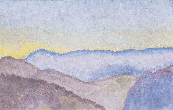
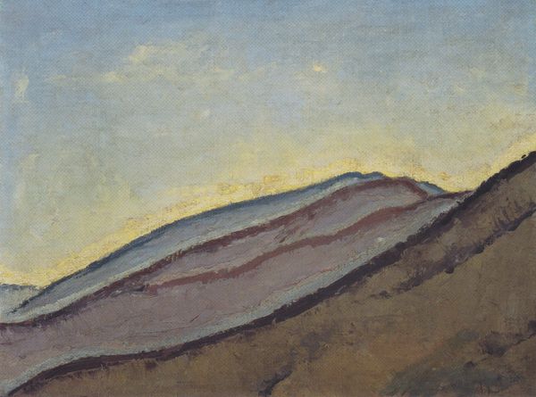
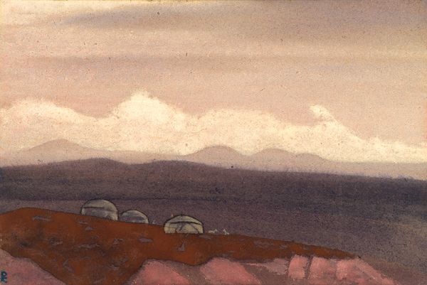
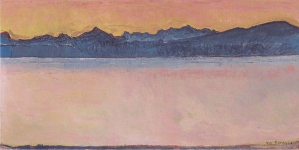
Nicholas Roerich made this small, untitled painting with tempera, and straight away I notice the deliberate nature of the marks, each one an intuitive decision, not overworked, just made. The colours are what get me, though, the way Roerich builds up these dreamy mountains with thin layers of purples, pinks, and oranges. You can almost feel the dry brushstrokes gliding across the surface, and the way the colours blend and shift creates this sense of depth and atmosphere, like you could step right into this landscape. There’s this small passage of orange and gold in the foreground that really catches my eye - it's like a little spark of warmth that balances the coolness of the blues and purples, giving the whole piece a kind of shimmering, ethereal quality. It reminds me of Marsden Hartley's landscapes, not in terms of style but in their shared sense of the sublime, and the way both artists use colour and form to evoke a spiritual connection to the natural world. Ultimately, it's not about knowing what the painting means, but about feeling something, maybe something unexpected, in the process of looking.
Comments
No comments
Be the first to comment and join the conversation on the ultimate creative platform.
More like this