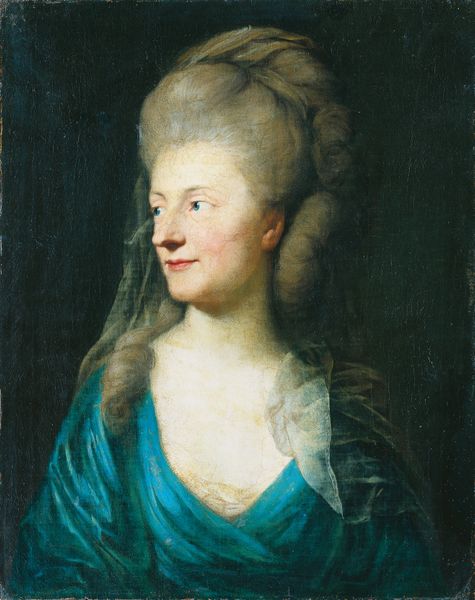
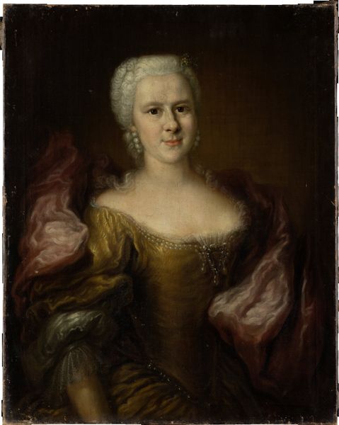
oil-paint
#
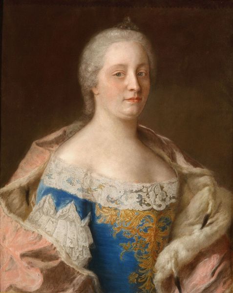
portrait
#
baroque
#
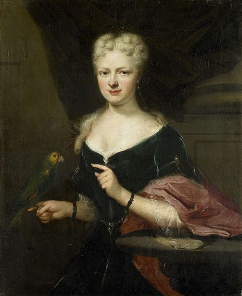
oil-paint
#
history-painting
#
academic-art
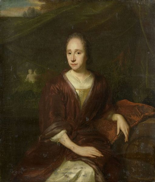
Dimensions: height 69.5 cm, width 56.5 cm, depth 8 cm
Copyright: Rijks Museum: Open Domain
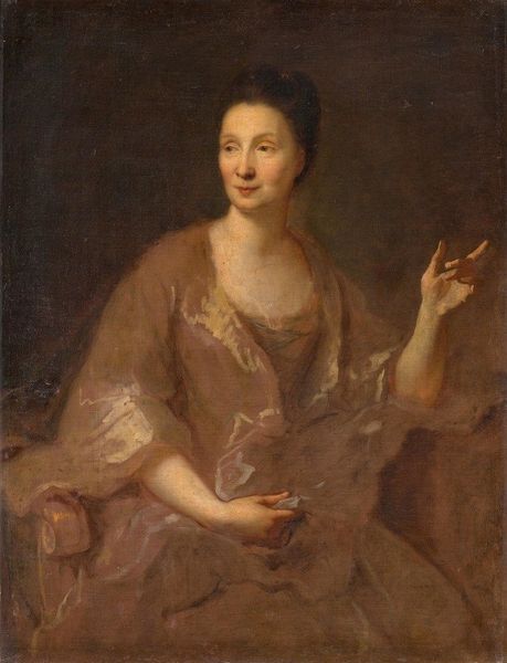
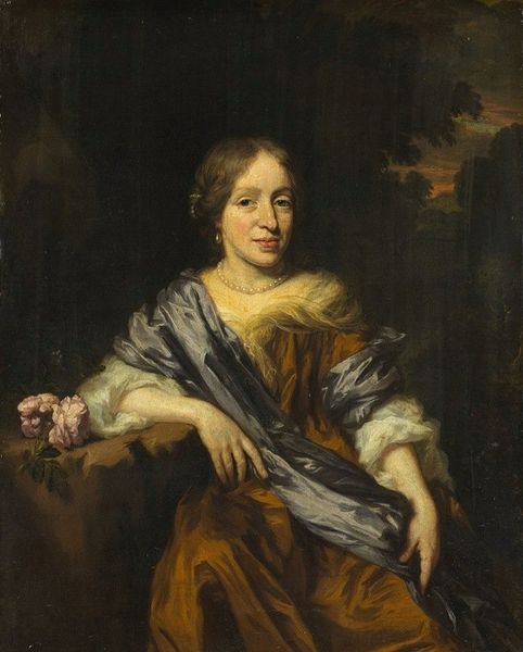
Curator: This is Cornelis Troost’s “Portrait of Louise Christina Trip, wife of Gerrit Sichterman,” created circa 1725. It's a compelling example of Baroque portraiture on display here at the Rijksmuseum. Editor: It exudes a sort of composed serenity. Her slight smile and the subdued palette create a really intriguing impression. The slightly blurred trees in the background really focus the eye on her figure, but give the sense that she is surrounded by the darkness of nature. Curator: Absolutely, the tonality plays a crucial role. Troost manipulates the interplay of light and shadow, lending a particular sculptural quality to her form. Notice the arrangement of her pose in contrast to the flat plane behind. She intersects her space vertically and horizontally with grace. Editor: Yes, the Baroque artists employed symbols liberally to transmit messages about their subjects. Do you see the relief carving beside her elbow? It depicts a cherubic figure—likely Cupid. Given this and the fact that she's wearing the sort of laced and bejeweled dress one wears when courting or finding a husband, do you agree that she is symbolizing the success of the marriage she made? Curator: Perhaps. I see instead a focus on surface texture and form. The sharp, bright carving adds tension through stark contrast to the loose painting. We're faced with multiple ways of presenting images and being in space. Editor: I wonder if the ambiguity of the landscape wasn't painted deliberately. There are enough formal devices, like line, and value at play in that plane, to make you wonder whether that area is representing some aspect of Louise's life, some feeling she wanted associated with her likeness. She gazes with serenity, it's true, but perhaps longing, too. Curator: What resonates is the material. There’s an undeniable sophistication to the brushwork, lending an almost palpable quality to the fabrics and her skin. I appreciate how that surface animation, as opposed to direct narrative reference, adds emotional richness. Editor: We are drawn back and forth from her status, made obvious through the dress and rendering style to the faint stirrings of passion. And you are correct—I appreciate its visual tactility and those contrasts. Curator: I’ll consider that in relation to the piece as I move forward with further analysis. Thanks.
Comments
No comments
Be the first to comment and join the conversation on the ultimate creative platform.
More like this