ink, engraving
#
portrait
#
baroque
#
dutch-golden-age
#
old engraving style
#
ink
#
engraving
Dimensions: height 286 mm, width 210 mm
Copyright: Rijks Museum: Open Domain
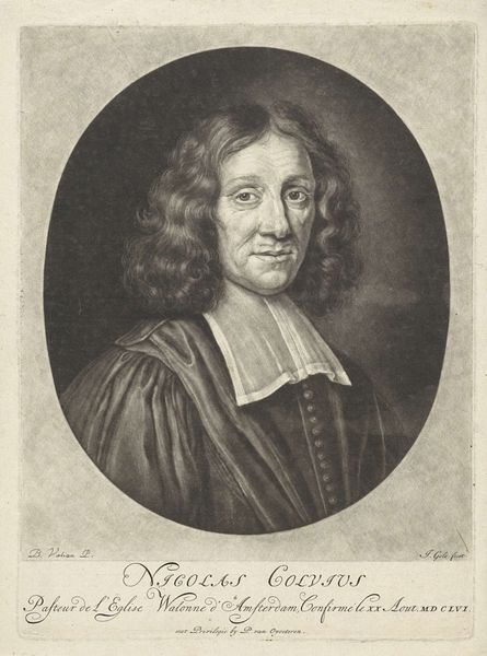
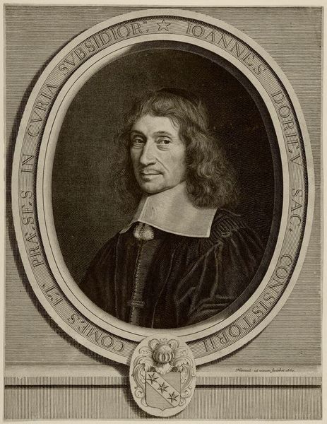
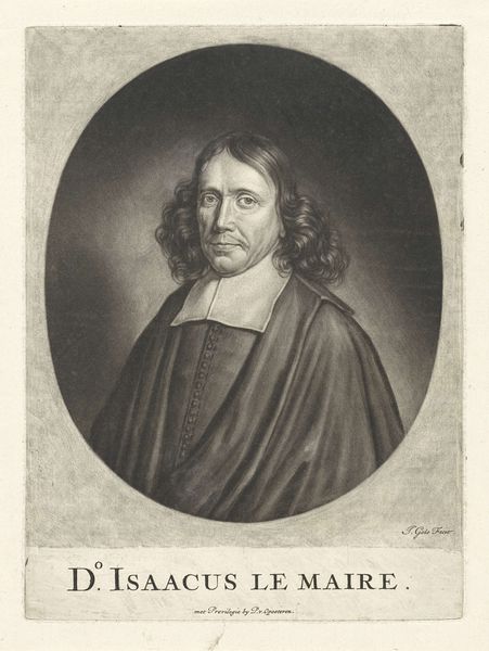
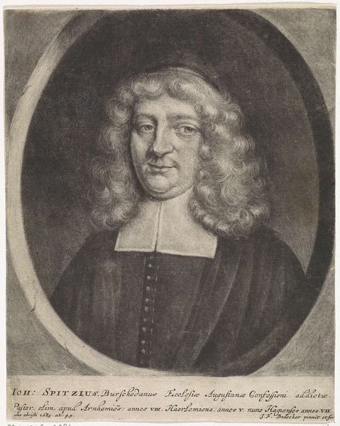
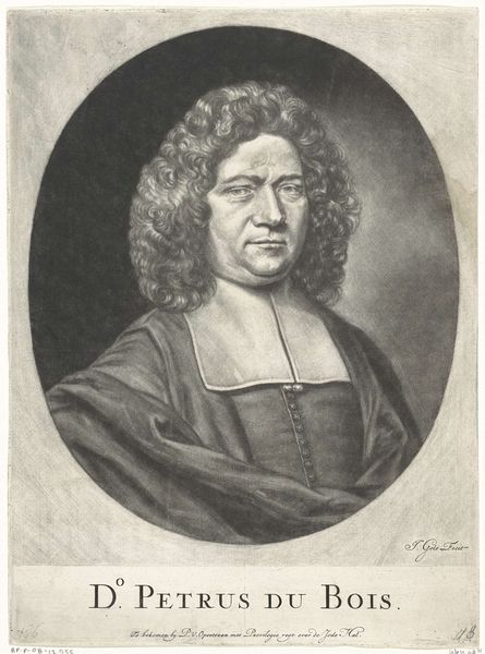
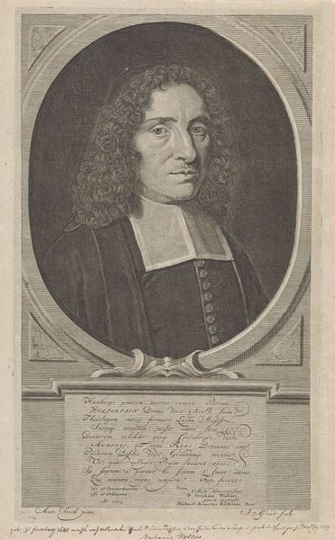
Editor: This is a rather stately portrait, isn't it? It's titled "Portret van Nicolaas de la Planque," created sometime between 1670 and 1724 by Jacob Gole. It's an engraving, so ink on paper. It feels quite formal and reserved... what stands out to you? Curator: Well, it certainly *is* a very respectable looking gentleman! It reminds me of those stiffly posed portraits you see in old family albums, everyone trying to look their absolute best for posterity. Notice the way the light catches the curls of his wig—Gole was really showing off his skill with the burin there! And those tiny little buttons, so precisely rendered! The Golden Age Dutch were mad for detail; almost obsessive about it, wouldn’t you agree? What do *you* make of his expression? Editor: He looks...slightly weary? Perhaps even a little melancholic? Is that a common theme in Baroque portraiture, that sense of internal contemplation? Curator: You’ve got a keen eye! Yes, I think so. Think about the big questions they were grappling with then; shifting worldviews, the rise of science challenging the old order, all of that philosophical turmoil often found its way into art. You might be projecting onto poor old Nicolaas here of course - portraits can be deceptive, no? But your intuition isn’t far off! Also remember, in Dutch Golden Age painting in general, wealth became much more openly represented through the portraits - to sit for a painted or engraved portrait was extremely costly! Editor: I never considered that it would reflect the wealth of the subject. Curator: Indeed. Think of those grand old paintings you see throughout this period and it helps explain why they seem a cut above a humble street dweller! I'm also realizing more and more that it’s about the quiet intensity, the kind that makes you want to peek into the subjects mind!
Comments
No comments
Be the first to comment and join the conversation on the ultimate creative platform.
More like this