Copyright: Public domain US
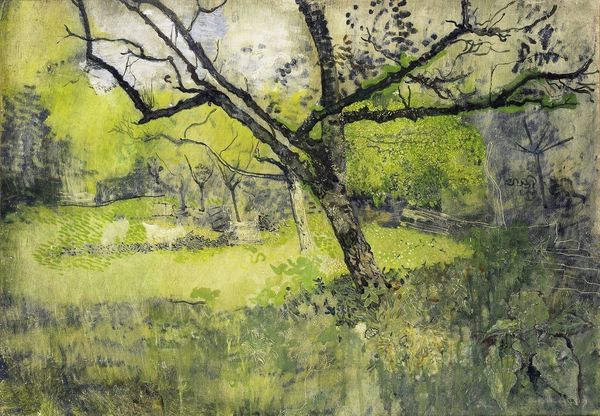
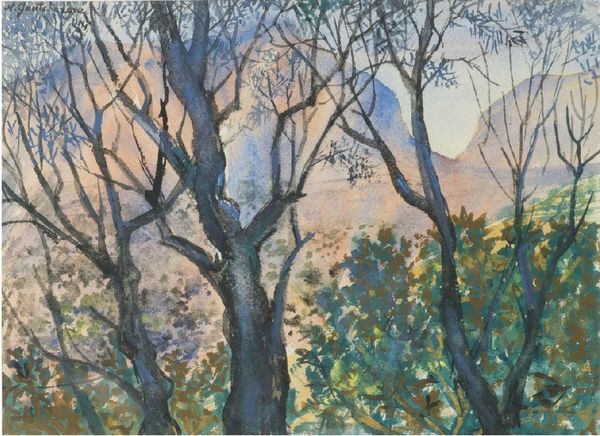
Zinaida Serebriakova’s ‘Before the Storm’ looks like it was made with watercolour, maybe gouache, and a whole lotta feeling! The palette is muted, all greys and greens, like the world holding its breath. Look at how she's built up the trees, the dark lines of the trunks against the lighter, almost translucent greens of the leaves. It’s all about layering, about letting the colours peek through. The whole thing feels kinda precarious, like it could all wash away. There's something about the way she's rendered that sky – see how the brushstrokes are loose and gestural, almost frantic? It's not just a storm coming, it's a whole mood, a feeling of anticipation, even dread. It reminds me a little of some of the landscapes of Emil Nolde, who managed to find the beauty in bleakness. Art isn't about answers, but more about the conversations we have along the way.
Comments
No comments
Be the first to comment and join the conversation on the ultimate creative platform.