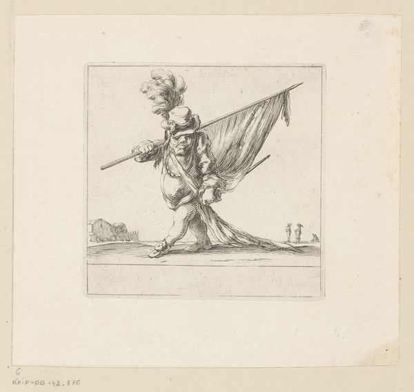
print, engraving
#
medieval
# print
#
figuration
#
line
#
history-painting
#
engraving
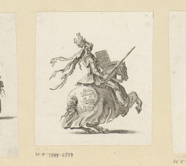
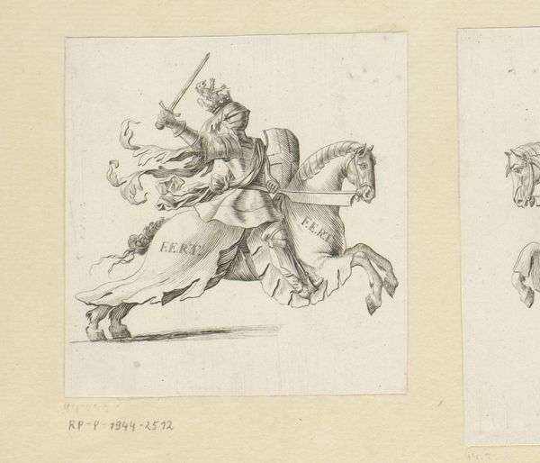
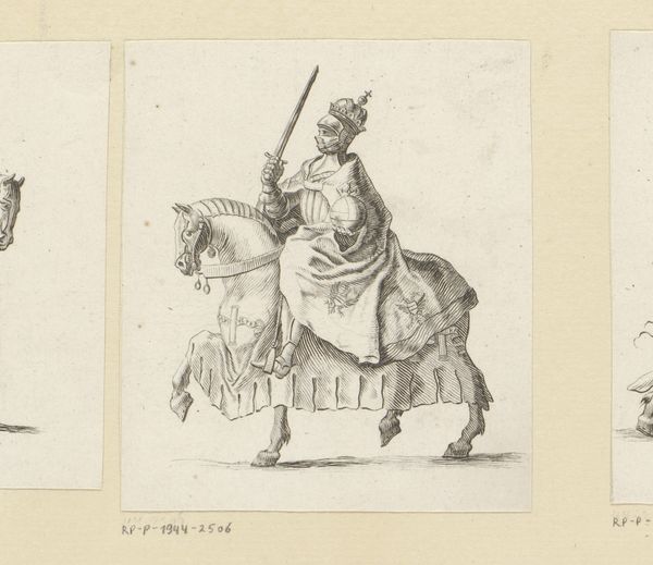
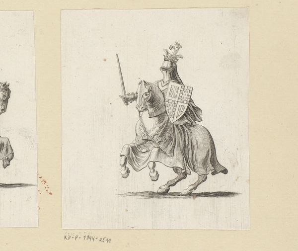
Dimensions: height 92 mm, width 92 mm
Copyright: Rijks Museum: Open Domain
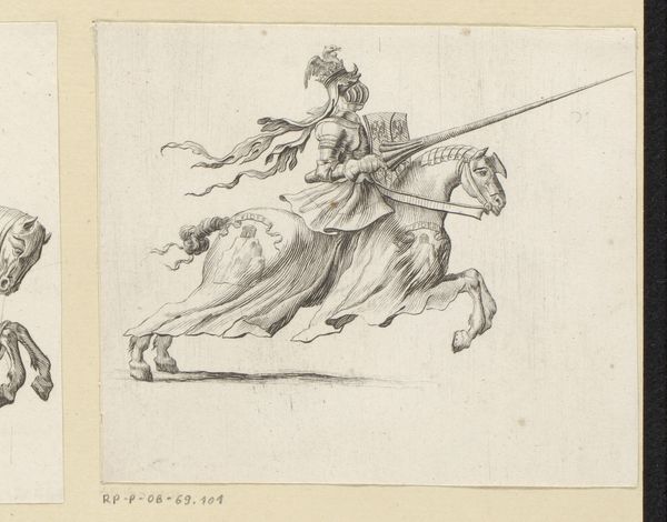
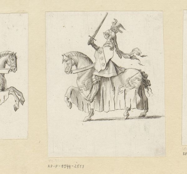
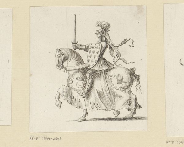
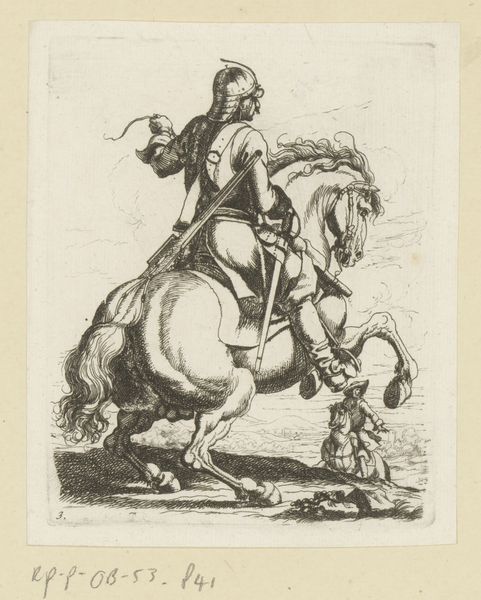
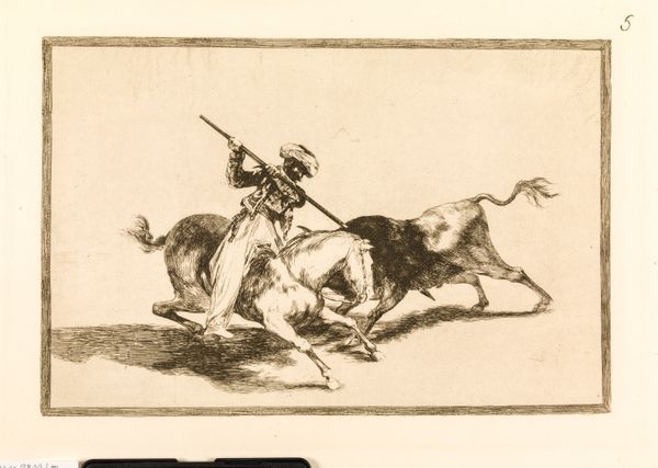
Editor: This is "Ridder te paard in wapenuitrusting," or "Knight on Horseback in Armor," an engraving made after 1647. The artist is anonymous, and the piece is held at the Rijksmuseum. The first thing that strikes me is how meticulously the details of the armor are rendered using such fine lines. How do you see this print, especially from a formal perspective? Curator: It's quite intriguing how the artist used the engraving technique to create various textures. Notice how the density and direction of the lines give volume to the knight's armor and the horse's musculature. What does the repetition of the fleur-de-lis on both the knight's shield and the horse's trappings communicate? Editor: I guess it emphasizes heraldry, like the emblem functions almost as branding across the composition. Curator: Precisely. Beyond representation, the composition guides our eye: The plumes on the helmet and the horse’s tail create strong diagonal lines, which, combined with the posture of the horse and the angle of the lance, communicate dynamic motion. Also, consider the negative space. The figure of the knight occupies a large space on the plane, with the even light revealing texture. How do these formal elements work together to support or challenge traditional portrayals of knights? Editor: That's a good point; considering how the lines are primarily focused on outlining form. Usually with historical works like this there is an attempt at depth. Maybe the artist wanted to highlight that two-dimensionality. I learned a lot just considering those intentional placements of lines. Curator: Yes, looking at art through this lens allows us to understand the creative intentions of even anonymous artists and uncover multiple layers within a piece, even a seemingly simple one.
Comments
No comments
Be the first to comment and join the conversation on the ultimate creative platform.
More like this