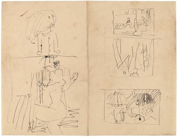
drawing
#
drawing
#
landscape
#
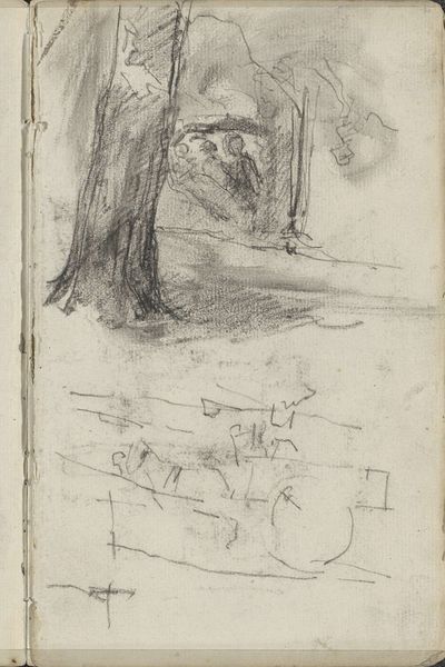
line
Copyright: National Gallery of Art: CC0 1.0
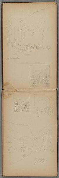
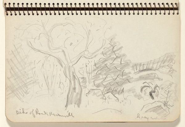
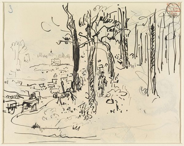
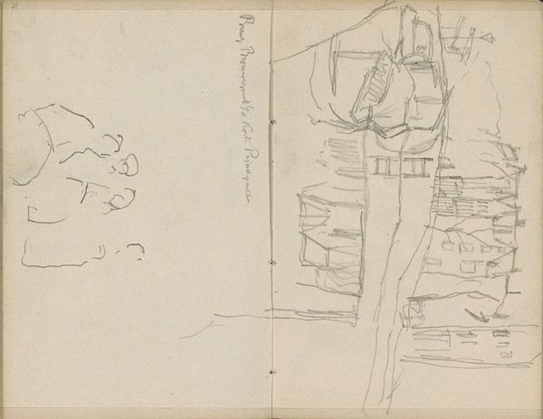
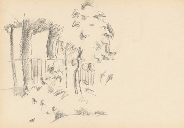
Editor: Here we have "Sheet with Two Landscape Sketches," a drawing by Mark Rothko. The line work is so free, almost like a doodle, yet the landscapes are definitely there. I'm getting a feeling of… simplicity and perhaps a little melancholy from this. What are your thoughts on this piece? Curator: Melancholy… yes, I feel that too. It's interesting to see Rothko, who later became so renowned for his abstract expressionism, engaging with such traditional subject matter. These aren’t finished works, more like fleeting impressions caught on paper. I wonder what captured his attention in these scenes? Did you notice the contrast in the way he's treated light and shadow in the top sketch versus the bottom? Editor: Now that you mention it, the top sketch seems heavier, more shaded. The bottom one feels lighter and more open, maybe more optimistic. Is there something in the composition that suggests this contrast? Curator: Perhaps. Consider the density of lines, for example. In the upper sketch, they’re layered thickly to suggest dense foliage, almost oppressive, whereas the lower one relies on fewer, more delicate lines to evoke a sense of airiness, the verticals reaching toward light. Maybe that was how Rothko, the artist, felt at the time. Do these impressions echo a sentiment for you as a viewer? Editor: That's a lovely way of thinking about it. The line density really does alter the mood so dramatically. The sketches become less about the literal landscapes, and more about an interior landscape of emotion. I’m now intrigued to know if he translated his experiences with these specific landscapes in other drawings, perhaps adding colour. Curator: Precisely! And remember, art is a conversation, a visual poem started by the artist but finished by you, the viewer. Never stop asking questions!
Comments
No comments
Be the first to comment and join the conversation on the ultimate creative platform.
More like this