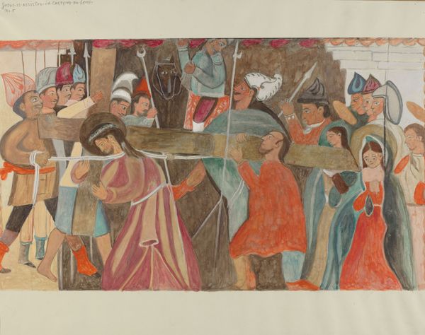
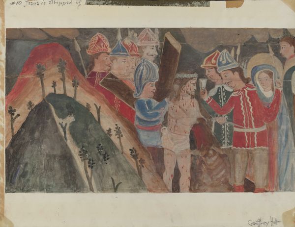
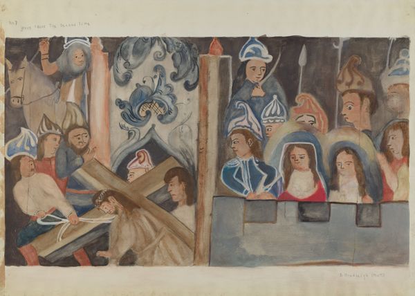
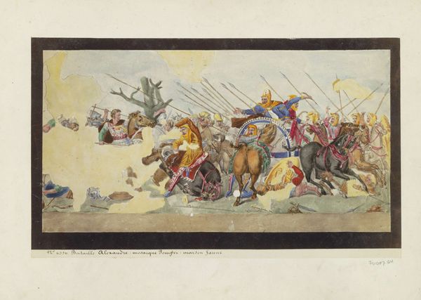
Station of the Cross No. 9: "Jesus Falls the Third Time c. 1936
0:00
0:00
drawing, painting, watercolor
#
drawing
#
water colours
#
narrative-art
#
painting
#
figuration
#
oil painting
#
watercolor
#
watercolor
Dimensions: overall: 38.4 x 50.7 cm (15 1/8 x 19 15/16 in.) Original IAD Object: Approximately 30 x 50 in.
Copyright: National Gallery of Art: CC0 1.0
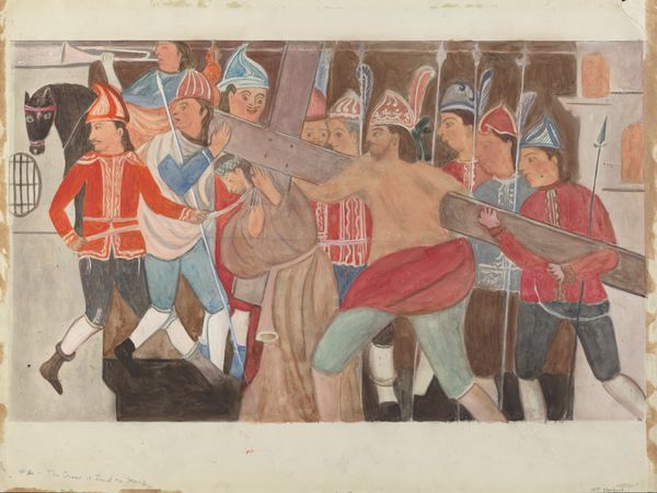
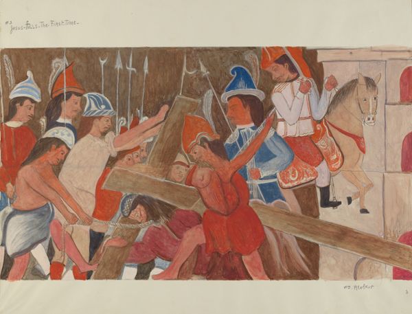
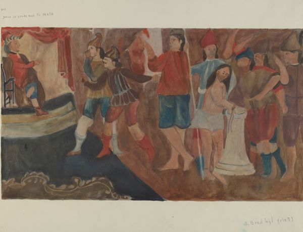
Curator: This is "Station of the Cross No. 9: "Jesus Falls the Third Time"", made circa 1936. It is rendered in watercolor by Beulah Bradleigh. Editor: There’s a disquieting rawness here, an unrefined quality that’s immediately striking. It feels both antique and urgent in its representation. Curator: Note the emphasis on line and form. The artist has simplified the figures, rendering them in broad strokes of muted color. This flattening effect contributes to the painting's medieval quality. It draws us back into time, almost removing temporal distance, while keeping the aesthetic at arm’s length. Editor: Yes, the choice of watercolor as a medium feels crucial here. Its inherent fluidity emphasizes the vulnerability and exhaustion evident in Jesus's pose, prone and struggling beneath the weight. One thinks of the labour, physical and emotional. Curator: Indeed. The composition leads the eye inexorably downwards, mimicking Jesus’s fall, underscoring the artwork's symbolic weight of human fallibility and divine sacrifice. Editor: And observe the array of characters surrounding Jesus—Roman soldiers, onlookers, figures of support. Consider how the material conditions of this event are suggested through the rudimentary depiction of clothing, armor, and weaponry, which feel historically flattened and anonymized, even caricatured. This shifts focus to production under oppressive rule. Curator: But observe the colour palette—a deliberate choice I believe. The somber tones, the lack of vivid colours, imbue the scene with a sense of solemnity and muted despair. See, even in the background, she offers only shades of sepia to complete the atmosphere, an airlessness as much psychological as chromatic. Editor: Precisely. The artist seems invested in underscoring the arduous process of creation mirroring the suffering and labor captured. Even those choices become freighted. Curator: A powerful visual construction from an artist who may be underappreciated, but perhaps that’s about to change, no? Editor: It’s difficult to view it and not come away with a deeper connection to the labor behind it all, artistic as well as historic. I'd call that an aesthetic experience as a work of processing history and trauma.
Comments
No comments
Be the first to comment and join the conversation on the ultimate creative platform.
More like this