drawing, paper, ink
#
drawing
#
paper
#
ink
Copyright: Rijks Museum: Open Domain
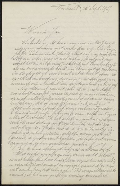
Curator: Here we have "Brief aan Jan Veth" by Adrianus Jacobus Terwen, likely created between 1874 and 1918. The piece, executed in ink on paper, is essentially a handwritten letter. Editor: The tight lines of script over graph paper lend it a somewhat austere yet intimate feel. It reminds me of a personal ledger, something very functional but also imbued with private thoughts. Curator: Yes, the grid paper acts as an underlayer to the organic, flowing quality of the writing. The marks of the pen create a layered texture against this regular geometry. What intrigues me most is how the visible grid contrasts the freedom expressed in calligraphic forms. Editor: I find myself wondering about the content of the letter and its historical significance, and what sort of relationship it documents. Does it reflect the socio-political atmosphere surrounding Terwen or Veth? Perhaps discussing artistic circles, exhibitions or shared ideals? It reads more as conversation between people than high art, which democratizes it. Curator: The interplay of straight versus curved becomes very powerful; and think of the materials: brittle paper, dark pooling ink. Consider also the tonal contrasts within each stroke, varying from delicate to dense. All create a compelling interplay on a flat surface. Editor: It’s true. A letter grounds you; its inherent value, as it becomes not a thing to consider but as part of a practice in communicating something. You almost feel the touch of Terwen on the paper. A potent reminder that so much art historically wasn’t meant for grand galleries. Curator: Exactly. It gives you a great glimpse of beauty created for no other purpose than communicating with another human being, as much as showing us an object of study. Editor: I feel drawn to this work in its humility as much as through your analytical dissection of its construction.
Comments
No comments
Be the first to comment and join the conversation on the ultimate creative platform.
More like this