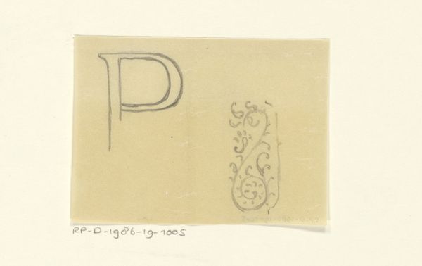
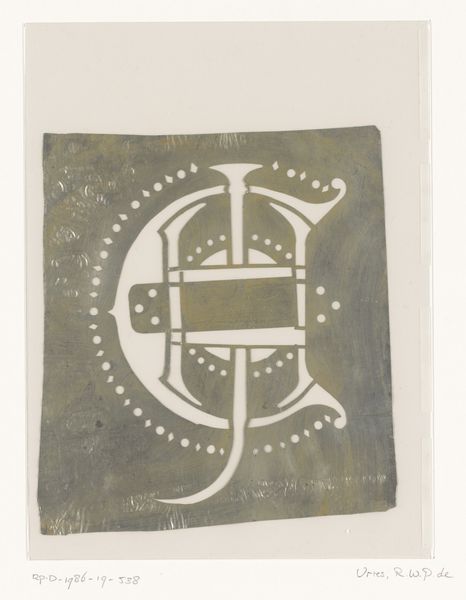
drawing, graphic-art, paper, typography
#
drawing
#
graphic-art
#
paper
#
typography
#
geometric
#
abstraction
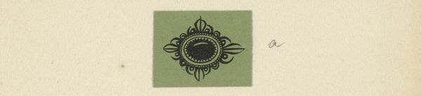
Dimensions: height 28 mm, width 40 mm
Copyright: Rijks Museum: Open Domain
Editor: This drawing on paper by Reinier Willem Petrus de Vries, titled "Monogram SHLC," appears to have been created between 1884 and 1952. It's so simple, yet the interlocking initials are intriguing. What do you make of this particular abstraction? Curator: What I find compelling is how the artist uses line and form to create a visually arresting geometric design. Observe the interplay of positive and negative space; how each letter is simultaneously distinct and unified. What is your reading of how the lines delineate and create distinct areas of definition? Editor: It’s true, the contrast definitely emphasizes the geometric nature of the typography, but how do you know there’s meaning without knowing about the society, its values? Does a purely formal reading give the complete picture? Curator: The 'meaning,' as you say, resides within the structure itself. The formal properties create an image that transcends its immediate context. We have paper, text, drawing; what do these raw elements communicate when presented in such a deliberate arrangement? Editor: I see your point, focusing on the materiality really brings out qualities I hadn't noticed before. Now, I am not fixated so much on its origin. Curator: Indeed, de Vries presents a unique compositional interplay within the elements of art: a convergence between color, texture, and form. And this converges upon shape in relation to how it uses the canvas it inhabits. Editor: Right. This conversation shifted my focus, because analyzing its material qualities opens avenues for appreciation beyond simply knowing its social context. Curator: Exactly. Formal analysis sharpens our perception, unveiling the essence of the artistic construction itself.
Comments
No comments
Be the first to comment and join the conversation on the ultimate creative platform.
More like this