drawing, mixed-media, paper, ink, pen
#
drawing
#
mixed-media
#
hand-lettering
#
old engraving style
#
hand drawn type
#
hand lettering
#
paper
#
personal sketchbook
#
ink
#
hand-drawn typeface
#
ink drawing experimentation
#
pen-ink sketch
#
pen work
#
sketchbook drawing
#
pen
#
calligraphy
Copyright: Rijks Museum: Open Domain
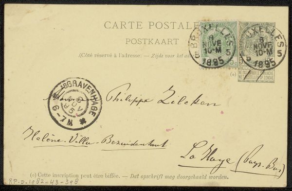
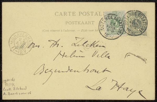
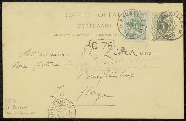
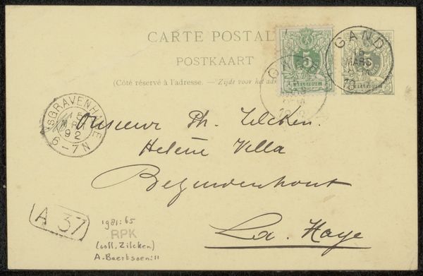
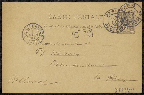
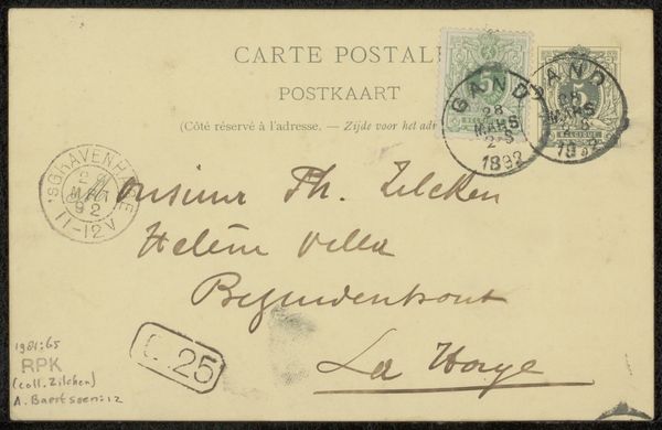
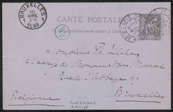
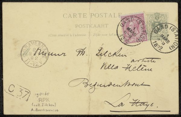
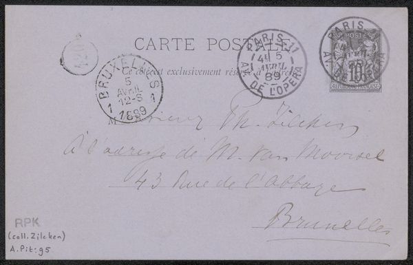
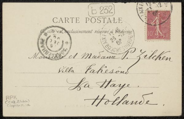
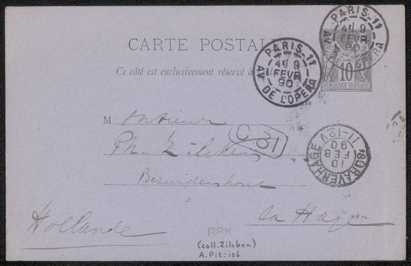
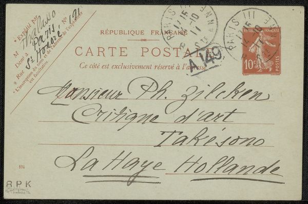
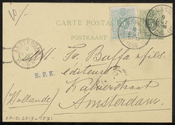
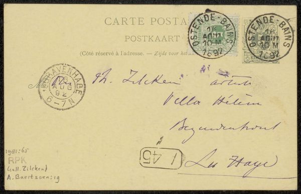
Editor: Here we have a mixed-media drawing on paper, using pen and ink, a postcard created before 1895 by Maurice Maeterlinck, titled "Briefkaart aan Philip Zilcken." The elegant, flowing calligraphy and official stamps lend it a certain bureaucratic grace. How do you interpret this piece through a formal lens? Curator: It is intriguing how Maeterlinck merges the functional with the aesthetic. Observe the distribution of text and the density of ink; the eye is drawn to the contrasting weights of the calligraphic script against the rigid stamps. The circular motifs of the postmarks offer a visual counterpoint to the linear arrangement of the address. Editor: So you’re saying the contrast between the handwriting and the official stamps is key to its aesthetic appeal? Curator: Precisely. Notice, too, the considered placement of each element. There's a tension between the deliberate composition and the casual nature of a handwritten note. What would you say about the empty space around the text? Editor: The negative space gives each element room to breathe, doesn’t it? It stops the postcard from feeling cluttered, even with all the different inscriptions. Curator: Indeed. The relationship between the figure and ground here is carefully balanced, isn't it? The variations in line thickness also contribute, guiding the viewer's eye through the piece. Do you see any geometrical considerations? Editor: Perhaps the implicit grid created by the lines of the address balanced with the circular forms of the stamps? The grid gives it order, and the circles, as you said, create a dynamic tension with those lines. I had never looked at a postcard like this before. Curator: Formal analysis allows us to uncover layers of intention even in the most commonplace objects. I'm glad you noticed those tensions.
Comments
No comments
Be the first to comment and join the conversation on the ultimate creative platform.
More like this