drawing, paper, pencil
#
drawing
#
impressionism
#
landscape
#
paper
#
pencil
#
horse
Copyright: Rijks Museum: Open Domain
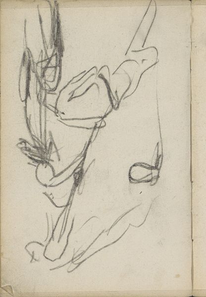
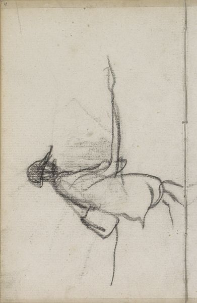
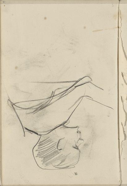
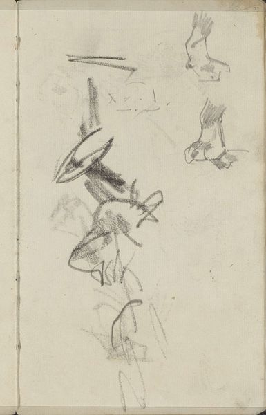
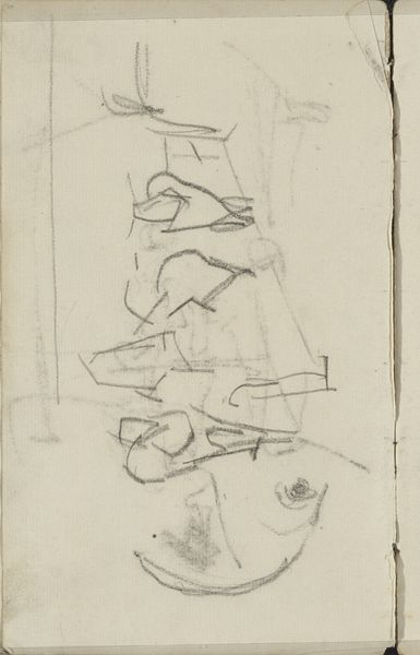
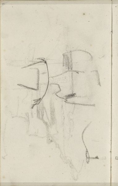
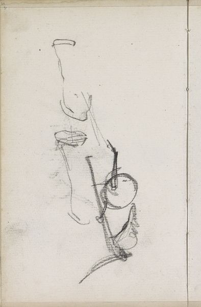
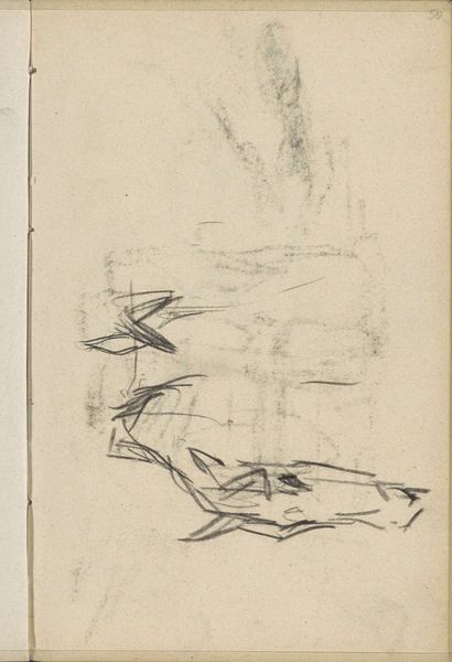
Curator: We are looking at "Paarden," or "Horses," a pencil drawing on paper by George Hendrik Breitner, dating from about 1884 to 1886. It's currently housed here at the Rijksmuseum. What are your initial thoughts? Editor: Stark. It strikes me as incredibly raw, unfinished, almost aggressively so. There’s an immediacy in the application of the pencil. It feels like a momentary sketch. Curator: Precisely. The sketch-like quality is central. Breitner was interested in capturing fleeting moments of everyday life. Note how the composition itself reinforces this: the horse is only partially rendered, as if abruptly seen and then just as quickly passed by. We could call it "proto-impressionistic." Editor: That's interesting. It really makes me consider the economic aspects that enabled such a loose style. Cheaper materials—paper instead of canvas, readily available pencils. But also, Breitner clearly understood the industrial forces transforming urban life. Were these horses work animals? What would this depiction mean to Breitner's contemporaries? Curator: Material conditions undeniably shape artistic production. Breitner was deeply embedded in the urban environment. The horse was then still essential to city infrastructure, a critical part of labor, goods transport, and Breitner's depiction makes use of impressionistic landscape sensibilities to enhance the image. Editor: I find it compelling how Breitner chose to leave so much undefined, unsaid. In doing so, he amplifies our focus on the horse. And by using this simple, rough technique he manages to achieve this focus and give that subject, a common work animal, significance. It almost has a quality like he scribbled the important essence of a horse right out. Curator: That openness creates an intriguing tension, forcing the viewer to actively participate in completing the image. But the lines he does choose—that curve of the back, the strong contour of the belly, so little needed to say it all. It reflects a very modern aesthetic. Editor: It speaks to a rapidly evolving urban experience and I feel like the material choices underscore that. Curator: A fleeting glimpse, expertly captured, a visual artifact of an age in transition. Editor: It’s certainly a potent reminder that artistic genius can emerge from something as humble as pencil on paper.
Comments
No comments
Be the first to comment and join the conversation on the ultimate creative platform.
More like this