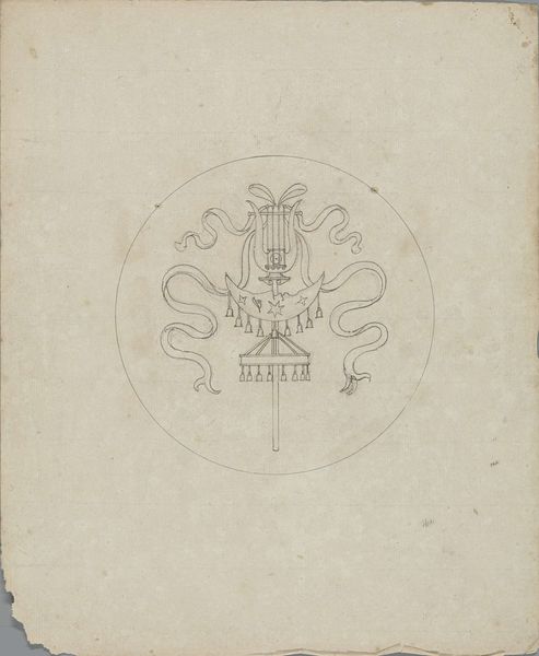
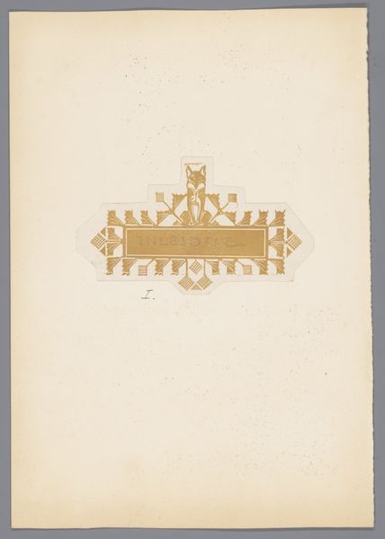
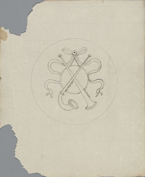
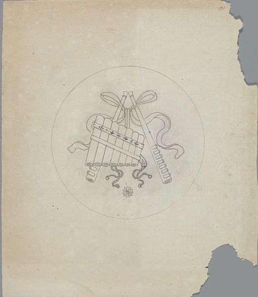
Ontwerpen voor advertenties van drogisterij Het Oranje Kruis en drogisterij Het Groene Kruis 1884 - 1952
0:00
0:00
drawing, graphic-art, paper, typography, pen, poster
#
drawing
#
graphic-art
#
dutch-golden-age
#
paper
#
typography
#
geometric
#
pen
#
decorative-art
#
poster
Dimensions: height 105 mm, width 118 mm, height 103 mm, width 201 mm
Copyright: Rijks Museum: Open Domain
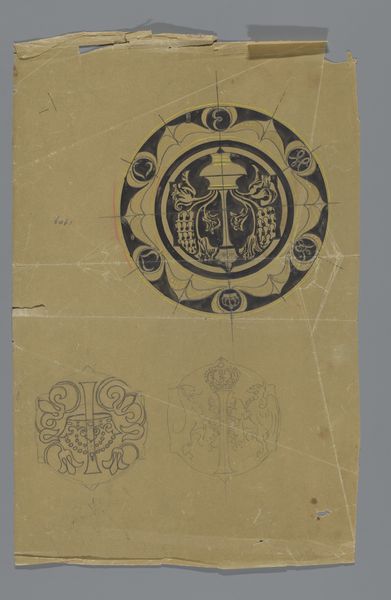
Reinier Willem Petrus de Vries created these advertisement designs for Het Oranje Kruis and Het Groene Kruis pharmacies. These organizations were born out of a desire to modernize and professionalize healthcare. Here, the symbol of the cross is used as a signifier of care, of attending to the vulnerable. Yet, we also see a crown, a sign of the monarchy, and flames underneath. These organizations were closely linked to notions of nationhood and citizenship. They provided care in a way which also advanced specific social ideals. We might consider how these images evoke care and community, but also speak to ideas about who is deserving of care. By connecting care with symbols of nationhood and royalty, they suggest a relationship between care, identity, and social order. What does it mean to attach the provision of healthcare to symbols of national identity? How might this shape people's feelings about belonging and worthiness?
Comments
No comments
Be the first to comment and join the conversation on the ultimate creative platform.
More like this