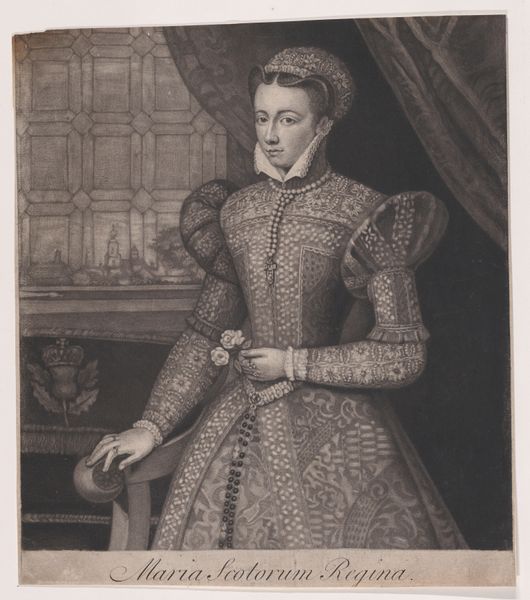
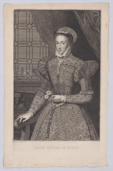
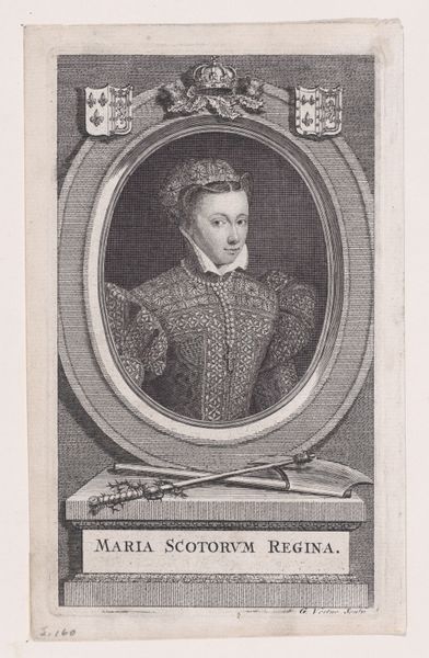
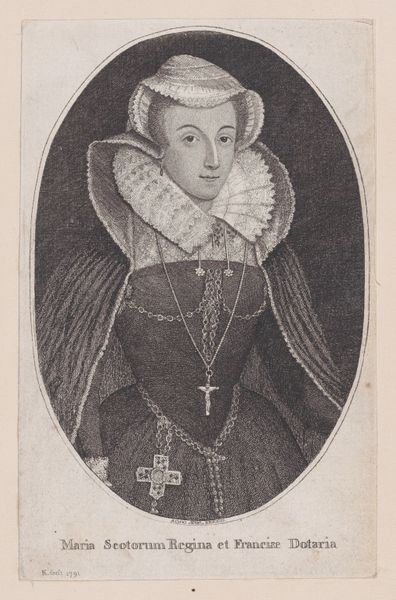
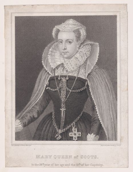
Mary, Queen of Scots (frontispiece, from "De vita et rebus gestis... principis Mariae Scotorum reginae, Franciae dotariae, quae scriptis tradidere autores sedecim...," volume 1) 1725
0:00
0:00
drawing, print, engraving
#
portrait
#
drawing
#
baroque
# print
#
engraving
Dimensions: Sheet: 12 1/16 × 7 7/8 in. (30.6 × 20 cm)
Copyright: Public Domain
Curator: This is an engraving from 1725 by George Vertue, titled "Mary, Queen of Scots." It’s actually a frontispiece from a book about her life. Editor: The first thing that strikes me is the sheer weight of history. There’s a quiet sadness to her face, a sort of premonition hanging in the air. She feels fragile against that imposing backdrop of what appears to be a fortress. Curator: That’s interesting you picked up on the fortress in the background, she has been described as intelligent, passionate, a romantic figure tragically caught between political tides of her time, England and Scotland. It would be nice if the image expressed those tensions. Editor: Right! The fortress in the distance looms almost as an idea, not something concrete, the actual imprisonment in her life, maybe. But her stillness here suggests a kind of symbolic weight bearing. What do you think about the choice to show her with that flower? I find the flower she holds somewhat poignant, its smallness amplifying a sense of delicacy amid power. Curator: I read the flower as representing her cultivated persona. Consider all that intricate detail in her dress. She appears very formally posed and regal, not unlike how people felt about her during her time as queen. Even though she ended up in prison. Editor: Yes, and her dress is interesting. You wouldn’t know this was an engraving just by glancing, would you? Vertue was known for his engraving skills, wasn't he? Curator: Absolutely. The level of detail is extraordinary and this skill brings out all of that weight in her sleeves and patterned bodice. Look at how the lines create textures so real, you can almost feel the fabric. This emphasis on detail, on the tangible, speaks to the Baroque aesthetic which really relished that texture. Editor: Do you feel like he portrays her objectively? Because I’m finding it difficult to avoid viewing the artwork through the lens of her historical drama, a queen with her history reduced to the quietude of the holding that solitary little flower. Curator: I agree completely, maybe we bring too much assumption from what we know about her. I think, at the very least, Vertue preserved an idea about her in his Baroque way. A sense of poised grace and regality. I found the act of remembrance captured so beautifully in this engraving quite fascinating. Editor: For me it's an image layered with foreboding—a moment of forced composure. I think that’s what will stay with me. The calm *before* the inevitable storm.
Comments
No comments
Be the first to comment and join the conversation on the ultimate creative platform.
More like this