Copyright: Rijks Museum: Open Domain
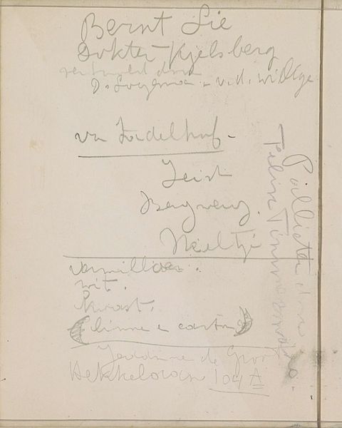
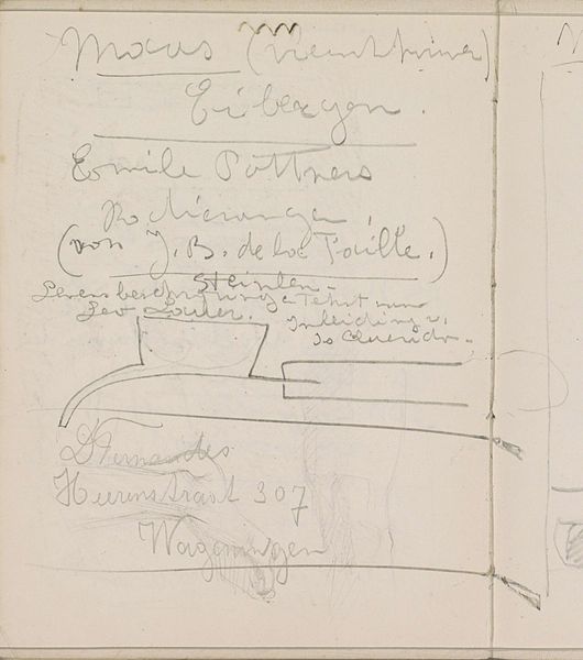
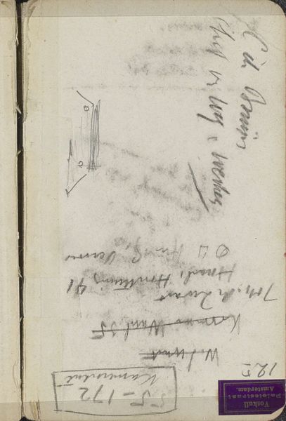
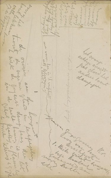
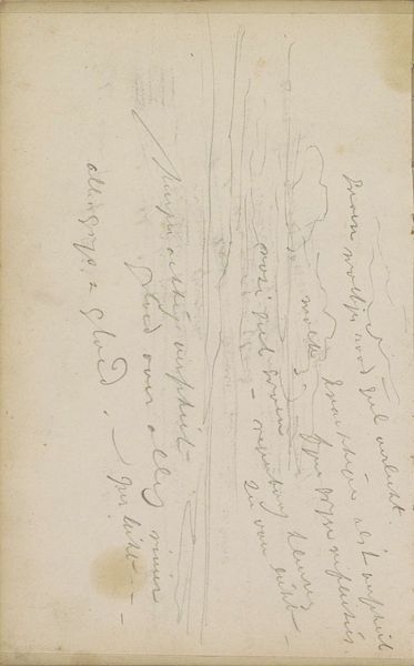
Curator: Look at this intriguing drawing! It's entitled "Decoratief ontwerp voor de Tegelfabriek Schiedam"—a Decorative Design for the Schiedam Tile Factory—and it comes to us from somewhere between 1906 and 1945. The artist is Reijer Stolk. Editor: Oh, I'm immediately drawn to the sketch-like quality, and the notes surrounding it, like snippets of thought still circling the central idea. There's a tentative beauty to it, a kind of intentional fragility. Curator: Indeed. The pencil lines give it a fleeting quality, as if we're looking at a preserved moment of creative brainstorming. We can see Art Nouveau influences in that geometric tilework, an aesthetic deeply entrenched in that era's symbolism and craft. The geometric framing really creates a sense of imposed structure. Editor: The lettering especially captures the Art Nouveau spirit so beautifully, doesn't it? I’m immediately reminded of that era’s embrace of craft traditions in visual communications. Notice that fading type? It tells of design in progress. And look closer at the hand-drawn typeface… you know, there is a sense of something really precious being created, isn’t there? It almost feels like unlocking some sacred knowledge from a forgotten script. Curator: Precisely! The symbols are multilayered: we see an aesthetic movement and a nod to industry represented side by side. Given its creation, it is perhaps an effort to imbue everyday, functional objects, like tiles, with artistry and meaning. Consider how radical that idea must have seemed at the time. The sketch almost argues that functional and expressive elements can share one space to enrich daily living. Editor: And don’t you find the overall mood is incredibly optimistic? The faint quality of the pencil feels like a seed of an idea full of growth potential, ready to be planted. As a symbol, the image embodies a really specific cultural yearning: one where beauty elevates utility. Curator: That is beautifully put. And now, reflecting on Reijer Stolk's design and the Schiedam Tile Factory it was for, I see an elegant example of visual symbiosis at play. It really invites a deeper inquiry into not just visual patterns, but into the essence of functional beauty. Editor: I concur. Thank you for leading us through this reflective study. It's a journey where every line, letter, and carefully positioned notation narrates something so poetic about an aesthetic in constant flux.
Comments
No comments
Be the first to comment and join the conversation on the ultimate creative platform.
More like this