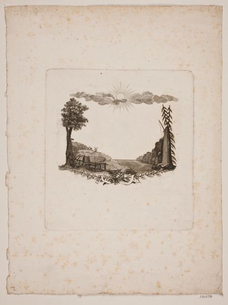
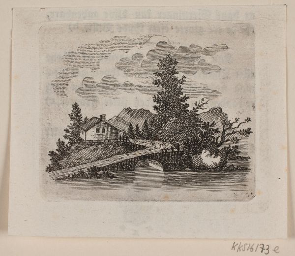
Vignet til Det Kongelige Danske Landhusholdningsselskab 1765 - 1833
0:00
0:00
print, engraving
# print
#
landscape
#
engraving
Dimensions: 161 mm (height) x 150 mm (width) (plademaal)
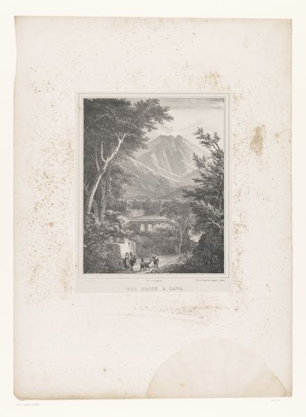
Curator: Let’s discuss this print titled "Vignet til Det Kongelige Danske Landhusholdningsselskab," created between 1765 and 1833, and residing here at the SMK. It’s an engraving by Gerhard Ludvig Lahde. What strikes you first? Editor: The symmetry, or rather asymmetry, is immediately apparent. A gnarled tree on the left opposes a steep cliff face on the right. There’s a compositional tension there, an interesting play of organic and inorganic forms. Curator: Precisely! Note how the framing is divided – the oak tree on one side, and a craggy stone cliff to the right. A miniature landscape exists in the divide, under an illuminating sky that hints at divine order. This landscape seems almost emblematic. Editor: Absolutely. The windmill speaks to human ingenuity working in harmony with nature, a subtle allusion to the agricultural pursuits that would concern the society to which it speaks. Curator: Beyond the literal landscape, the imagery chosen becomes evocative – the flourishing vegetation as symbols of potential and prosperity, set within what looks to be a balanced natural microcosm. Even the light filtering down becomes indicative of possibility, potential growth within a stable context. Editor: And the laurel wreath binding the lower portion! Another familiar symbol of accomplishment and honour. The deliberate contrast of sharp detail and softer shading brings depth but also emphasizes the inscription at its core: Selskabets Skrifters Deel... It’s really a very self-contained little universe, all pointing towards this organization. Curator: Note how Lahde plays with texture too, smooth expanses against dense hatching to emphasize the difference between, say, sky and foliage. Semiotic codes become almost visceral thanks to these stark textural contrasts. Editor: Considering this emblem’s date, the emphasis placed upon illumination aligns seamlessly with enlightenment ideals of reason, clarity, and progress that permeate so much visual and philosophical work from the era. I find its carefully calibrated iconography subtly compelling. Curator: The balance within the design speaks to an ambition of stability. A testament to human efforts, but also, significantly, natural process within Danish identity. Editor: Seeing how this little tableau interweaves the natural with those early industrial elements reveals the period's particular ambitions; an enduring image that represents more than meets the casual glance.
Comments
No comments
Be the first to comment and join the conversation on the ultimate creative platform.
More like this