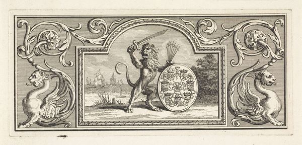
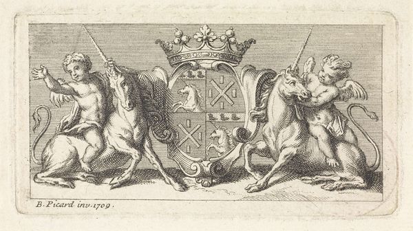
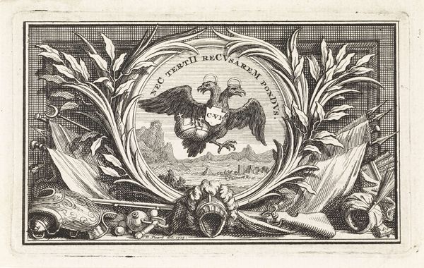
Vignet met de Nederlandse leeuw met het wapen van de Zeven Verenigde Provinciën 1683 - 1733
bernardpicart
Rijksmuseum
drawing, ink, engraving
drawing
allegory
baroque
pen drawing
ink
cityscape
engraving
Dimensions: height 72 mm, width 163 mm
Copyright: Rijks Museum: Open Domain
Editor: Here we have a pen and ink drawing titled "Vignet met de Nederlandse leeuw met het wapen van de Zeven Verenigde Provinciën," created between 1683 and 1733. It's currently held in the Rijksmuseum and attributed to Bernard Picart. The level of detail achieved with just pen and ink is quite striking, especially the almost whimsical ornamentation at the margins. How do you approach a piece so heavily laden with symbolism? Curator: Let us first consider the purely visual elements. Notice the strong central symmetry countered by the dynamic asymmetry of the lion and sword. This interplay creates a visual tension, further emphasized by the contrast between the detailed foreground and the less defined cityscape background. Do you observe how the artist uses line weight to direct our gaze? Editor: Yes, the darker, bolder lines of the lion and the ornamentation really make those elements pop out. It also guides your eye through all of the various elements. What effect do you think the texture has on this piece, particularly when one considers it is not, say, an oil on canvas? Curator: The texture, achieved through the density and variation of the ink lines, imparts a unique tactile quality, despite being a two-dimensional work. The hatching and cross-hatching create a sense of depth and volume, enhancing the visual weight of the allegorical figures. Also note the baroque character of these forms, which lends itself so readily to engraving. Can you describe some of the aesthetic effects in terms of line and shape? Editor: Well, the lines in the background elements like the ships on the sea, look almost like short scribbles as opposed to the more careful execution in the lion itself. It helps with perspective I think because those objects almost recede into the background. I now have a deeper appreciation for how all those details are integrated into a singular composition. Curator: Precisely! And by analyzing the relationship between line, form, and texture, we come to appreciate how Picart transformed relatively simple materials into a powerful statement. Every stroke contributes to the overall design. I’m glad this formal deconstruction opened your eyes.
Comments
No comments
Be the first to comment and join the conversation on the ultimate creative platform.