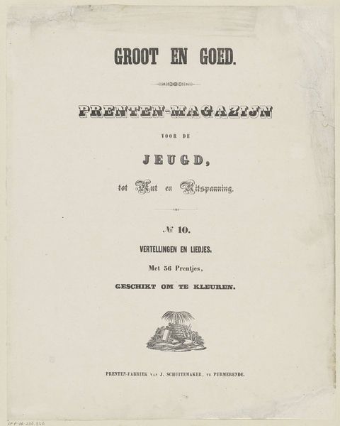
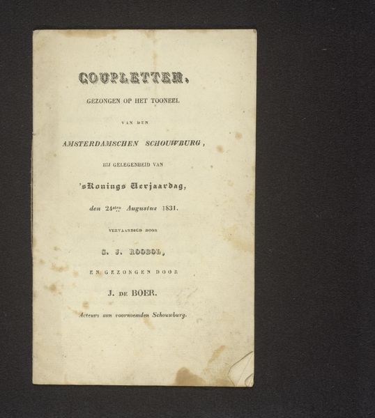
Prenten-magazijn / voor de / jeugd, / tot nut en uitspanning / No. 9. / Lezen en Zingen. / Met 16 muzijkstukjes en 56 prentjes. / Geschikt of te kleuren 1853
0:00
0:00
graphic-art, print, paper, poster
#
graphic-art
#
water colours
#
dutch-golden-age
# print
#
paper
#
coloured pencil
#
poster
Dimensions: height 410 mm, width 326 mm
Copyright: Rijks Museum: Open Domain
Jan Schuitemaker made this book cover – Prenten-magazijn voor de Jeugd – as part of a series intended, as the title suggests, to be a picture magazine for young people. The magazine, printed in the Netherlands, was designed for ‘nut en uitspanning’ – use and recreation. It combined the popular pastimes of reading and singing. Most strikingly, it was suitable for colouring. The reference here to ‘youth’ is telling: with the rise of industrial capitalism in the nineteenth century, the category of childhood became a subject of increasing social and institutional focus. The cover uses visual codes that combine decoration with child-like playfulness. The lettering suggests the bold forms of a circus poster, while the symmetrical border creates an impression of formal elegance. To understand the role of this artwork, it is important to consider the growing importance of education and leisure in the Netherlands at this time. Social historians have shown the part such magazines played in shaping values and behaviours, and how they reflected changing ideas about the status of childhood.
Comments
No comments
Be the first to comment and join the conversation on the ultimate creative platform.
More like this