c. 1890 - 1922
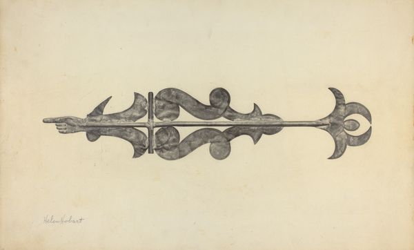
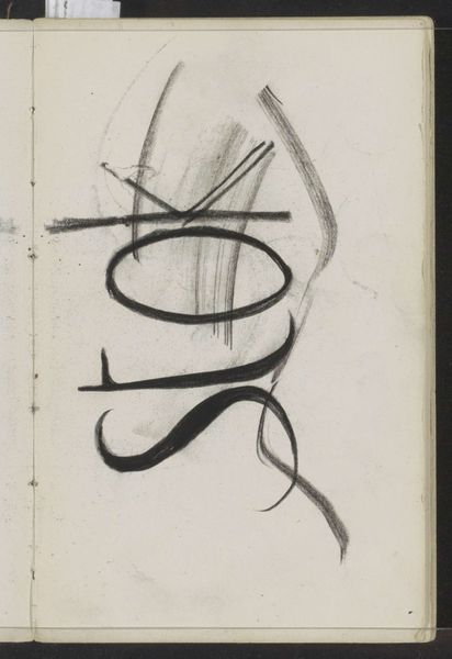
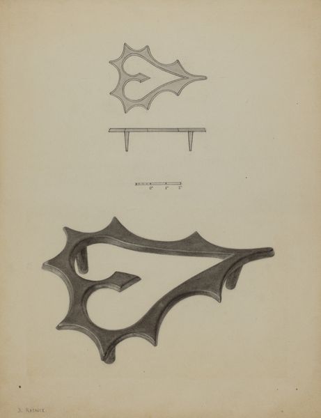
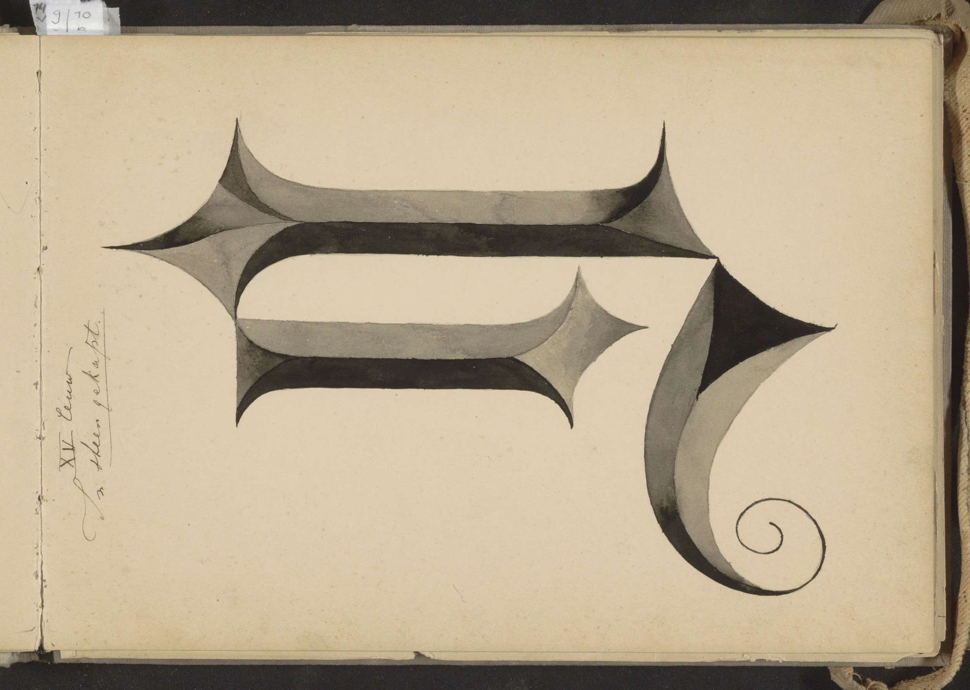
Vijftiende-eeuwse letter N, naar een uit steen gekapt voorbeeld
Listen to curator's interpretation
Curatorial notes
This watercolor of the fifteenth-century letter ‘N’ was made by Johanna van de Kamer. We see here a study in form that is not just representational but deeply interpretive. The letter ‘N’ is rendered with a striking dimensionality, achieved through a sophisticated interplay of light and shadow. Each line and curve is carefully modulated, the gray tones giving a sense of depth and weight, as if it were indeed hewn from stone. The serifs, extended into diamond-like projections, lend the letter a dynamic tension, contrasting with the smooth, spiraling tail that grounds the form. Van de Kamer’s approach transforms a simple letter into an exploration of sculptural qualities. The semiotic function of the ‘N’ is almost secondary to its aesthetic presence; it invites us to consider how letters, beyond their communicative role, can become objects of artistic contemplation, embodying structural and spatial ideas. This piece reminds us that even the most functional designs carry the potential for profound artistic expression.