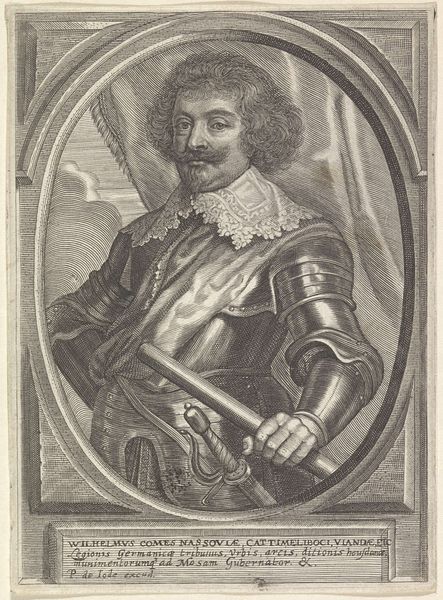
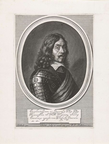
engraving
#
portrait
#
medieval
#
baroque
#
old engraving style
#
figuration
#
form
#
line
#
history-painting
#
engraving
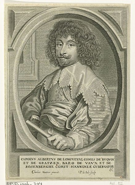
Dimensions: height 161 mm, width 118 mm
Copyright: Rijks Museum: Open Domain
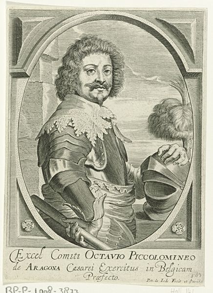
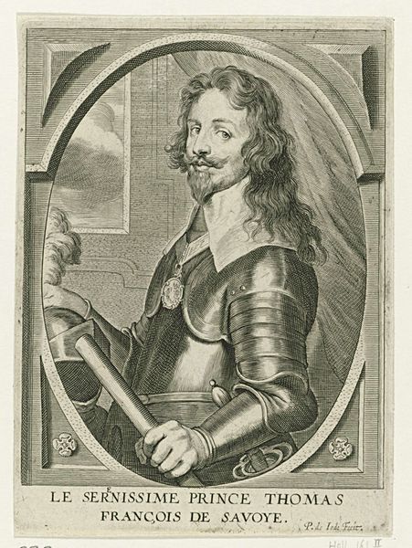
Curator: The first impression I get is...powerful. Stern, almost. Look at those lines; they carve out such a resolute figure. What do you see? Editor: You know, that steely gaze just reinforces established authority for me, especially combined with the Baroque framing. It really speaks to a particular kind of inherited privilege. The inscription tells us this is Carolus de Longueval, Governor of Hainaut... it is important to note that Longueval was the commander of the imperial army that conquered that territory. Curator: Ah, always with the context! But you're right, knowing who he was does color things. But purely visually, even divorced from that, don’t you find the rendering impressive? The textures, the way light catches on the armor? Editor: Definitely, and it's interesting that you mention the light reflecting off the armor because in this time of imperial control it is easy to fall into romanticizing the Baroque era, or focusing only on the technique and light; and that would be easy to do in ignoring the brutal power structures at play here, right? Curator: Very true. You remind me how we have to recognize whose stories are being told, and whose aren’t, right? Editor: Precisely. The artist, Pieter de Jode the Younger, worked in Antwerp during a tumultuous period, so this isn't just a portrait; it’s a strategic image. How does a ruler want to be seen by those conquered by their governance and reign? Curator: So it's more than just lines on paper. And to create this effect using solely engraving… Incredible discipline and planning to achieve that richness of tone. What do you walk away with? Editor: Longueval in armor stares from the page, forever embedded within this context, but perhaps made accessible by virtue of art itself... Curator: For me, it’s the stark contrast. Brutal power depicted with incredible refinement, all rendered in monochrome. There’s a somberness that's both alluring and… unsettling, as you note, the very definition of Baroque tensions.
Comments
No comments
Be the first to comment and join the conversation on the ultimate creative platform.
More like this