drawing, print, ink, graphite
#
drawing
#
quirky illustration
#
quirky sketch
#
narrative-art
#
pen drawing
# print
#
pen sketch
#
personal sketchbook
#
ink
#
folk-art
#
geometric
#
pen-ink sketch
#
pen work
#
graphite
#
sketchbook drawing
#
history-painting
#
storyboard and sketchbook work
#
decorative-art
#
sketchbook art
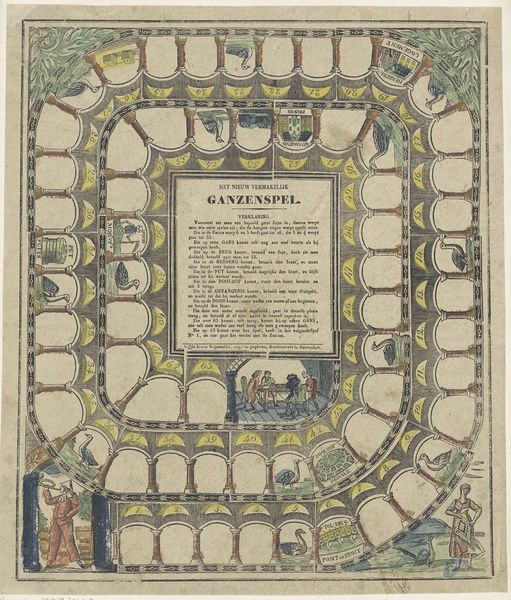
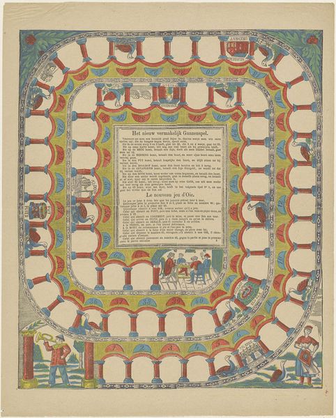
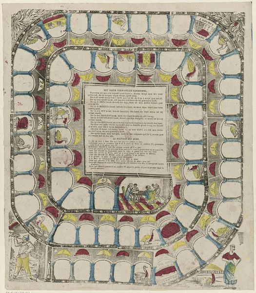
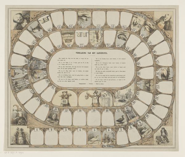
Dimensions: height 526 mm, width 442 mm
Copyright: Rijks Museum: Open Domain
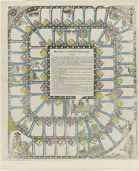
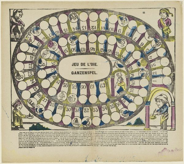
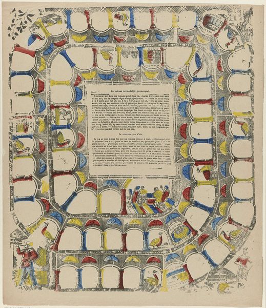
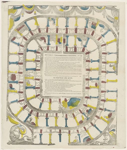
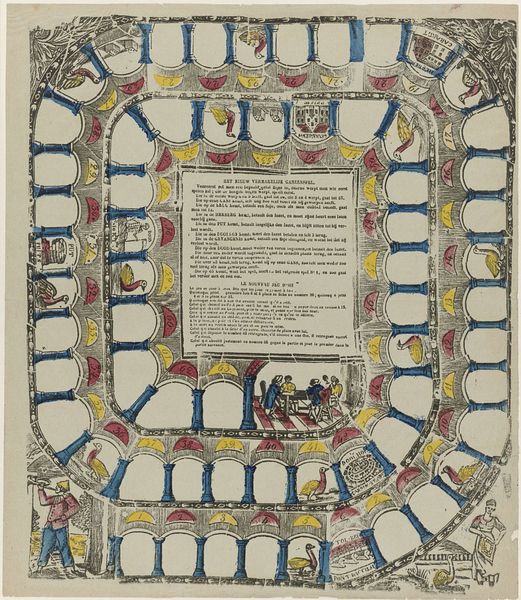
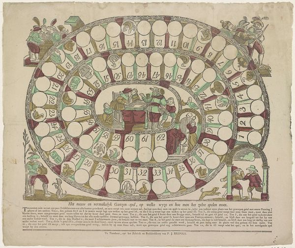
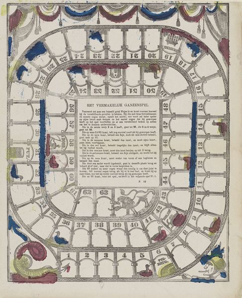
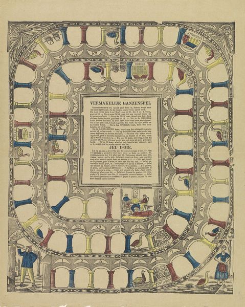
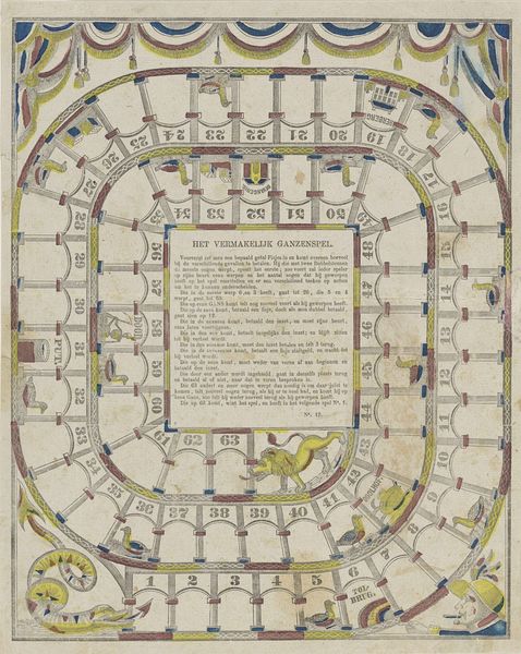
Editor: Here we have "Ganzenspel," created around 1870 by J.J. Sleijser. It appears to be a print incorporating ink, graphite, and perhaps other drawing media. I’m struck by its design; it resembles a board game. What compositional elements do you find most interesting? Curator: The compartmentalized space, divided into numbered sections, each functioning almost like a miniature frame. Note how this disrupts the potential for linear perspective, creating a flattened picture plane typical of decorative arts. Observe, too, how figuration and text work together: the integration of the explanatory "Verklaring" within the image itself and the strategic placements of goose figures across numbered squares. What effect do these compositional decisions produce for you? Editor: It’s a little confusing at first glance but inviting. The way the board is arranged, almost spiraling, draws the eye inward. I see now how each small image functions as a sign, referencing potential game mechanics. Curator: Precisely. It eschews realistic representation. The geese, the children at square 63—they operate as signs rather than representations, directing the viewer’s movement within the visual field of the game. What, then, is the artwork ultimately prioritizing: aesthetic experience or functional purpose? Editor: That’s interesting… perhaps it doesn't prioritize either fully but operates in the space between. Thanks, I appreciate your insights into its composition! Curator: A pleasure. Examining its semiotic architecture reveals fascinating design principles.
Comments
No comments
Be the first to comment and join the conversation on the ultimate creative platform.
More like this