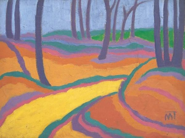
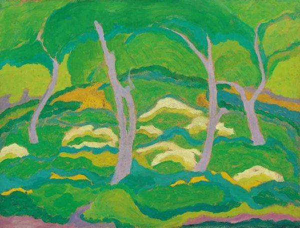
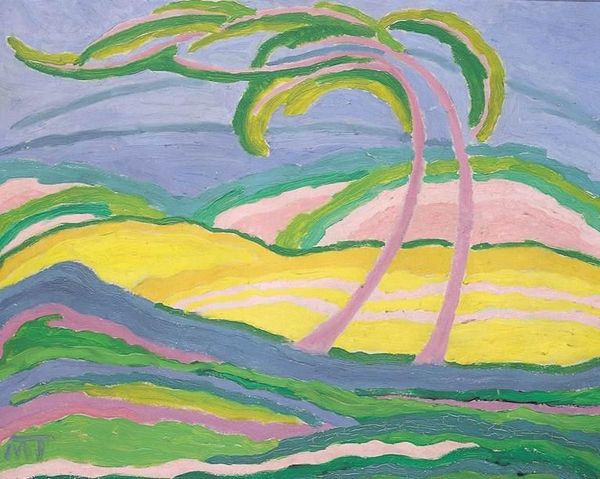
painting
abstract expressionism
organic
abstract painting
painting
landscape
organic pattern
expressionism
abstract-art
abstract art
Copyright: Public domain US
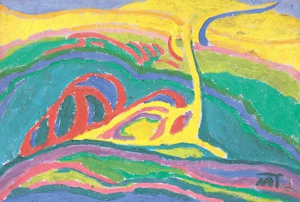
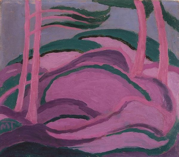
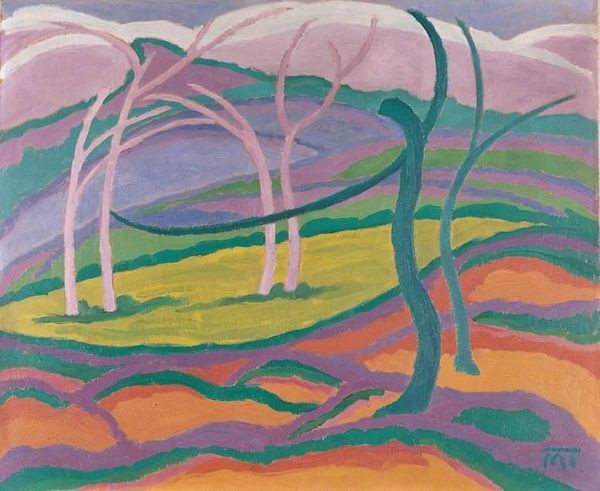
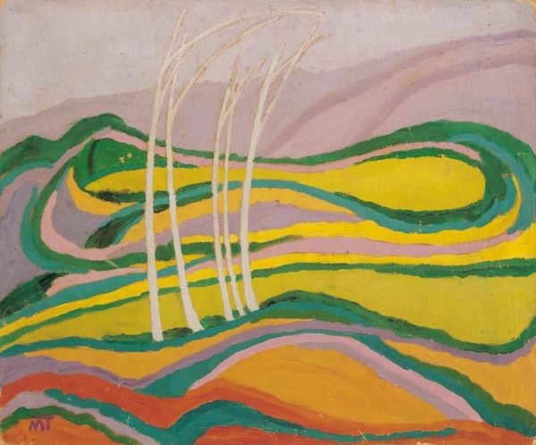
Janos Mattis-Teutsch, sometime in the early to mid twentieth century, made this painting called ‘Spring’ with a kind of determined joy, using vibrant colours in bold strokes. The material quality of the paint is really apparent; you can almost feel the texture. Look at how the colours don’t quite mix but sit alongside each other, creating a lively, almost vibrating surface. The way he uses the pinks and greens feels very intuitive, like he's responding directly to the landscape but also to some internal rhythm. Check out the upper left corner where the dark blue 'trees' are hovering, they make me think of Emil Nolde, particularly how he wasn’t afraid to use colours that some people might find clashing. It's this tension that keeps us engaged, pushing against easy answers and reminding us that art is always a conversation.
Comments
No comments
Be the first to comment and join the conversation on the ultimate creative platform.