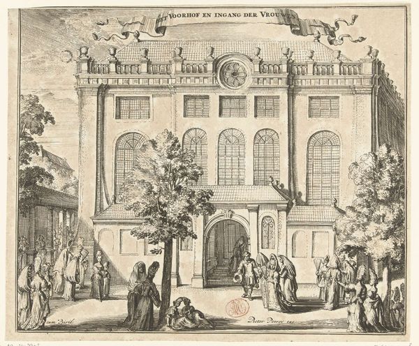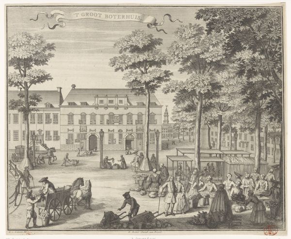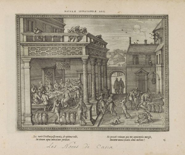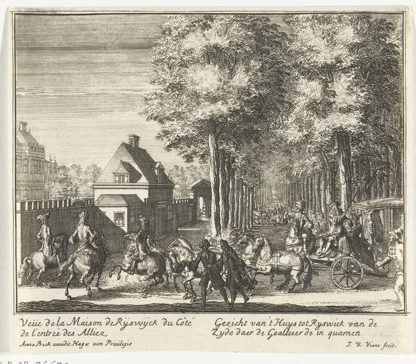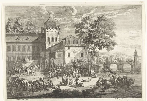
De scholen en reinigingsplaatsen bij de Portugese Synagoge te Amsterdam, ca. 1695 c. 1695
romeyndehooghe
Rijksmuseum
print, etching, engraving
baroque
pen drawing
dutch-golden-age
etching
line
cityscape
history-painting
engraving
Dimensions: height 240 mm, width 286 mm
Copyright: Rijks Museum: Open Domain
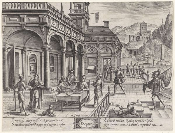
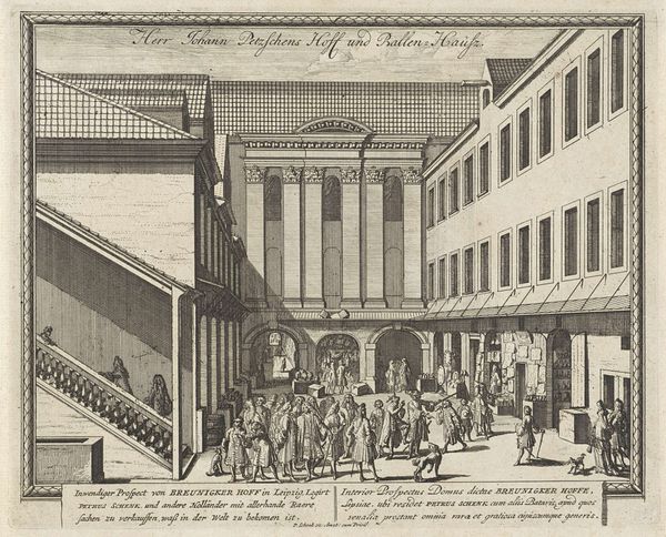
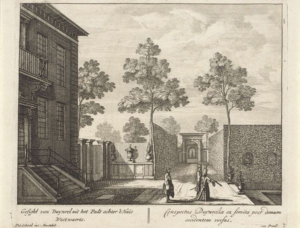
Editor: We’re looking at “De scholen en reinigingsplaatsen bij de Portugese Synagoge te Amsterdam,” dating from around 1695, an engraving by Romeyn de Hooghe held at the Rijksmuseum. The scene, rendered in precise lines, depicts several buildings and many figures populating what I assume are the schools and courtyards named in the title. I am drawn to the composition: it almost feels like a stage. What strikes you about it? Curator: The architectural rendering immediately commands attention. Observe how de Hooghe employs linear perspective, receding into the background to create depth. The consistent use of line—evident in the meticulously etched bricks, the figures’ clothing, and even the foliage—establishes a visual rhythm that guides the eye across the composition. The regularity of the architecture plays against the diverse positions of the figures within this cityscape. Are you intrigued by any particular visual elements? Editor: I noticed the figures along the lower register are cut off by the boundary, or maybe a wall? It makes me feel like I'm watching them secretly. Curator: That visual interruption adds a certain dynamism. More than simply representing architecture, de Hooghe focuses on the constructed frame and the relation of depth, line, and negative space. The placement suggests that our gaze is deliberately positioned, not simply observing, but participating. How does the overall absence of color affect your perception of the piece? Editor: It's interesting, I almost don't miss the color. The details feel more important because of it. Curator: Precisely. The monochromatic scheme forces us to engage with the line, form, and spatial arrangement. It compels us to consider how the artwork functions as a self-contained system of signs, referencing its subject yet existing independently. Editor: It's a completely different way to look at it; paying attention to those structural relations rather than its historical depiction or narrative context gives a new perspective. Thanks for sharing your view. Curator: My pleasure. By focusing on the formal qualities, we uncover the artistic intention behind the representation, and that's truly interesting to me.
Comments
No comments
Be the first to comment and join the conversation on the ultimate creative platform.
