#
dutch-golden-age
# print
#
genre-painting
Dimensions: height 340 mm, width 424 mm
Copyright: Rijks Museum: Open Domain
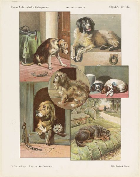
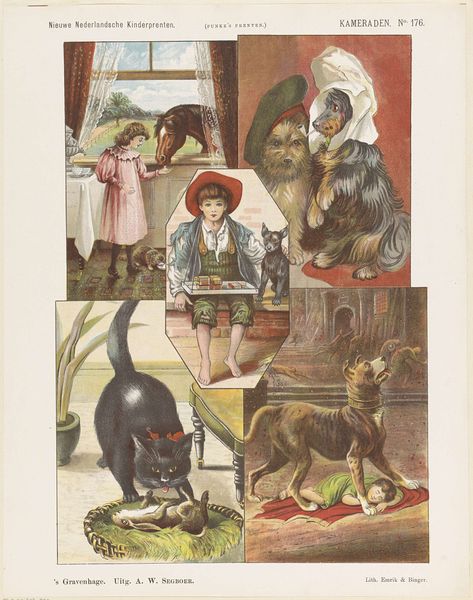
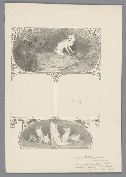
Curator: Here we have a Dutch print from the late 19th or early 20th century, titled "Honden en Katten" which translates to "Dogs and Cats". The artist is Jan de Haan. It appears to be a charming example of a children's print. Editor: Charming indeed! My immediate impression is how cleverly De Haan has organized it. The arrangement of the vignettes creates a surprisingly harmonious whole, despite depicting varied scenes. There's a sense of narrative collage, each frame hinting at a story. Curator: Yes, each vignette depicts a different aspect of the relationship between dogs and cats. The overarching theme of companionship and contrasting behaviors is palpable. Take, for instance, the scene where the cat is enjoying Azor's, most likely the dog's, lunch. The contrast shows domesticity as the opposite of war or unrest. Editor: The way the images are framed contributes a lot, as well. Look at the curvilinear way the vignettes have been set and separated to emulate torn fragments and evoke childhood imagination. It’s a style we might expect in Victorian or early 20th century designs—a whimsical yet orderly presentation. I'm drawn to the color palette—the muted tones that evoke a sense of nostalgia, perhaps suggesting the comforting simplicity of childhood. The text integrated adds a unique semiotic layer. Curator: The visual imagery reinforces the intended meaning as the Dutch culture evolved. Consider the inclusion of domestic animals: it indicates an increasing appreciation for pets and mirrors trends that continue even now. These pets aren’t merely functional; they become companions, subjects of sentimental affection. This represents a broader shift in societal values. Editor: The semiotic weight of this, therefore, is substantial, representing societal relationships. As for my take, I enjoy analyzing the clever compositional strategies and the balanced asymmetry—making this "children's print" far more conceptually intriguing than it appears at first glance. Curator: The image’s design provides a sweet lens through which to interpret and explore evolving family and emotional dynamics as they reflect childhood. Editor: It’s really been lovely to consider Jan de Haan's work!
Comments
No comments
Be the first to comment and join the conversation on the ultimate creative platform.
More like this