Copyright: Public domain
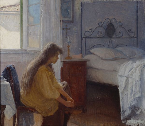
Editor: Walter Osborne’s "The Dolls' School," created around 1900 with watercolors, presents a quaint, domestic scene. I’m immediately drawn to the subtle, almost dreamlike quality of the painting; the hazy outlines and muted colors create a sense of gentle nostalgia. What compositional elements stand out to you? Curator: The interplay between the figure and her surroundings is compelling. Notice how Osborne uses the bedframe and the parallel lines of the bedsheets to structure the space. This creates distinct zones within the composition. Editor: So, it’s less about the literal scene and more about how the lines are directing our vision? Curator: Precisely. Observe the color palette. Osborne uses a range of neutral tones—browns, greys, and whites—punctuated by small areas of saturated blue and red. Note how this restricts the visual range of the scene and also provides visual cues to particular focal points. Editor: The limited palette does give it that very cohesive feel, holding the elements together. It’s all very contained. I find myself wondering, are there underlying theoretical concerns beyond just the representational aspect? Curator: I suggest considering the artist’s treatment of light and shadow. Osborne delicately balances light and shadow which contributes to a flattening of form which emphasises shape over perspectival realism. Look closely at the planes of the bed. Ask yourself how that plane has been treated with highlights? Editor: Now I see the formal emphasis that is not just in the thematics but in the painting’s technical choices. I appreciate the structure of the color palette, and that you can break it down to how shape trumps the perspectival, for instance. Curator: Indeed, analysing artistic choices in relation to color, line, form, and their subsequent effect will improve your art viewing experience and understanding.
Comments
No comments
Be the first to comment and join the conversation on the ultimate creative platform.
More like this