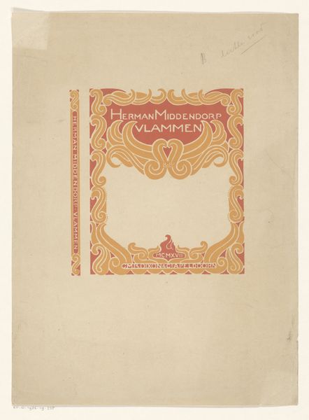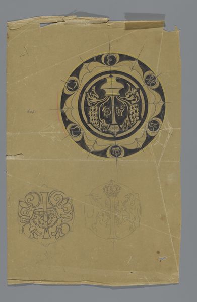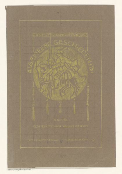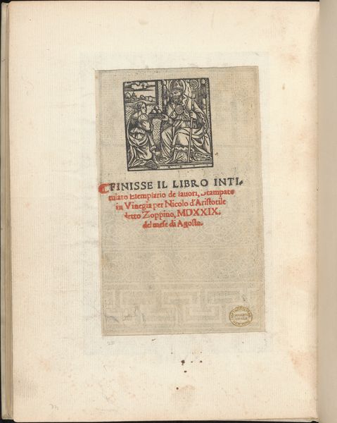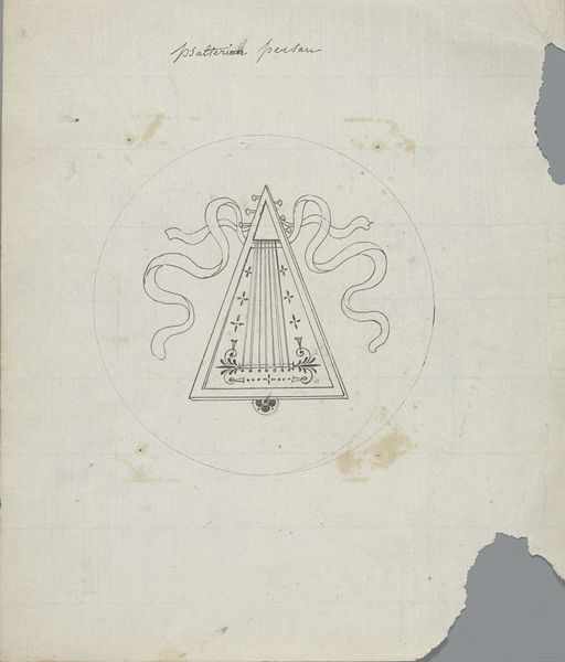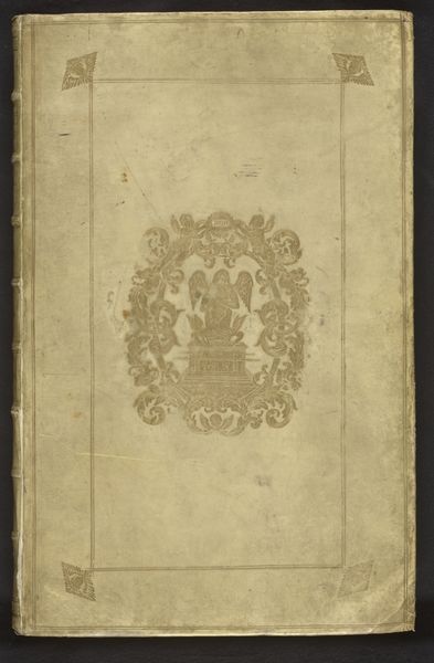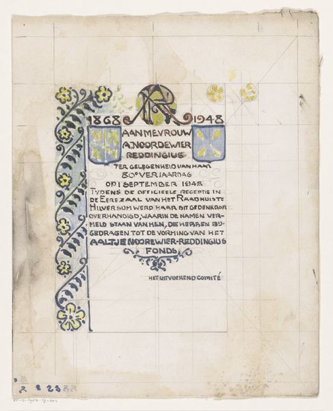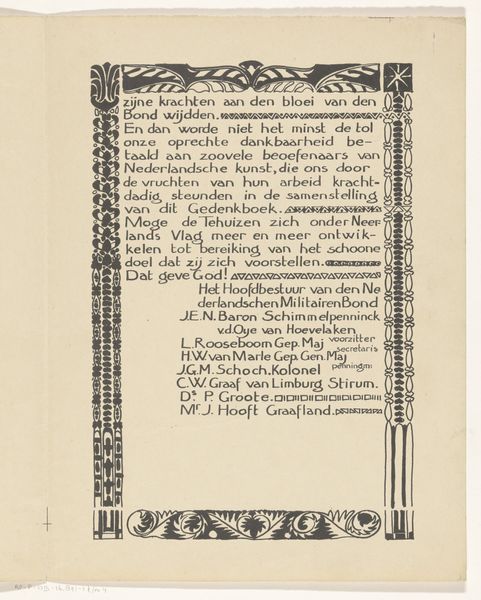
Bandontwerp voor: Herman Robbers, Van stilte en stemming, 1905 1905
0:00
0:00
drawing, graphic-art, typography, pen
#
drawing
#
graphic-art
#
aged paper
#
toned paper
#
light pencil work
#
art-nouveau
#
ink paper printed
#
old engraving style
#
hand drawn type
#
personal sketchbook
#
typography
#
ink colored
#
sketchbook drawing
#
pen
#
sketchbook art
Dimensions: height 199 mm, width 184 mm
Copyright: Rijks Museum: Open Domain
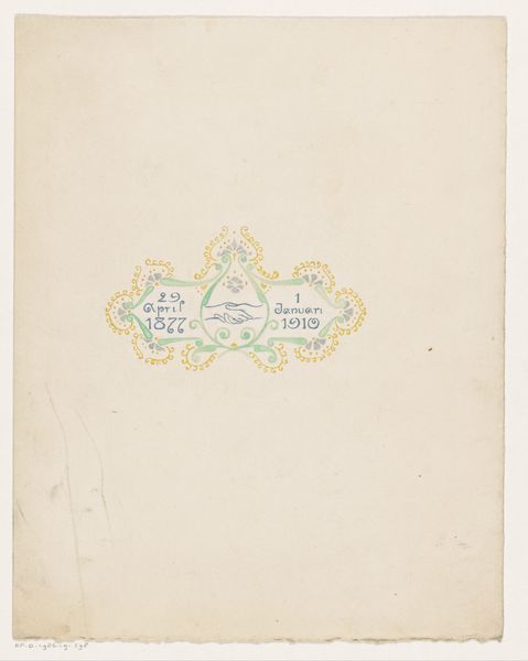
Curator: At first glance, the delicate lines and muted palette create a feeling of quiet elegance, reminiscent of old parchment and forgotten stories. Editor: This is a design drawing by Reinier Willem Petrus de Vries from 1905. It's titled "Bandontwerp voor: Herman Robbers, Van stilte en stemming", which translates to "Cover design for: Herman Robbers, Of silence and mood”. The work showcases the principles of Art Nouveau in its typography and the graphic elements. Curator: The composition is very deliberate; the symmetrical avian figures draw the eye downwards, creating a balanced structure between text and image. The colour of the paper acts as a foundation for the visual information, working to create an intrinsic wholeness of the design. Editor: Art Nouveau was closely linked to Symbolism and became extremely popular in the design of books and promotional materials. One may read into the title— "Of silence and mood"–, and see how it evokes an almost anti-industrial sentiment, focusing on the inner life of individuals. The cultural movement was also linked to early nationalist movements across Europe. Curator: Do you think this design functions to represent a "mood", an idea of national character or an imagined idyll, as some interpreted Symbolist and Art Nouveau pieces? It would suggest that each visual component—the text, image, colour and even the materials– works to create something symbolic in the broader sense. Editor: I do think there is an important relation between those themes and the emerging Dutch national identity around 1900. Many artists attempted to distill an essence of what it meant to be Dutch during this period, which also influenced architecture and other art forms. You can also note how "Amsterdam" features at the bottom of this design and its role within forming such "Dutchness" . Curator: An excellent point; by identifying its location in the lower register, it transforms the book cover into something grounded within its place and production, and which would likely signal ideas and messages to its intended reader. The artist has also balanced those material signals with something more intrinsic in feeling. Editor: Precisely. And it gives one insight into the role of design in the early 20th century; acting not merely as commercial branding, but becoming intimately entwined with constructions of national identity.
Comments
No comments
Be the first to comment and join the conversation on the ultimate creative platform.
