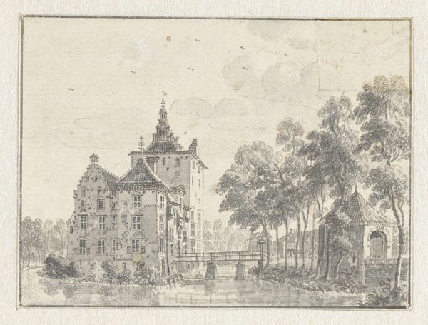
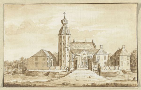
drawing, paper, ink
#
drawing
#
baroque
#
landscape
#
paper
#
ink
#
cityscape
Dimensions: height 146 mm, width 241 mm
Copyright: Rijks Museum: Open Domain
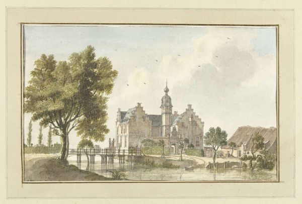
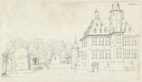
Curator: So here we have a drawing called "Huis Zuilestein of Zuylestein," created between 1685 and 1735 by Abraham Rademaker, currently housed at the Rijksmuseum. What's your first impression? Editor: Bleak, utterly bleak. But beautifully so. It's like a sepia-toned memory of a once-grand estate. The architecture feels so rigid, almost austere, but that washed ink gives it a kind of ghostly allure. Curator: Exactly! Rademaker captured a certain monumentality, even in a medium as delicate as ink on paper. It’s a baroque landscape drawing, typical of the era's interest in depicting estates and architectural structures, cityscapes—the height of man's dominion. Editor: "Dominion" feels right, but heavy. All those horizontal and vertical lines dividing the space...the repetitive windows, the squared landscaping... it's as if someone sought to impose order, even subdue nature, you know? A visual manifestation of control, though rendered in such muted tones. Curator: The formality is certainly undeniable, reflective of the Huis Zuilestein's societal importance and history; note how your eye moves through it—from the building, to the garden spaces—in controlled sweeps, stopping at its details, but drawn by how all these components interact. Editor: Mmm, tell me about those details because that is the most exciting part; like, notice that single flag on top of the tower! Also the texture is gorgeous; almost looks like rain softly hitting stone. I want to walk right in there, and write poetry from the highest tower. Curator: Consider this, though: how the seemingly simple rendering technique speaks to the era's printmaking practices. The image would have been engraved; ink wash, the application to paper is deliberate. Editor: It does feel like it could leap off the page, replicated ad infinitum. Still, what strikes me most is the mood – that stark tranquility. You look, and it feels ancient. Curator: It speaks of an age when art was employed to document a certain controlled way of life and idealized understanding of one's environment; a window to how the privileged presented themselves and the world around them. Thanks for sharing your perspective, always enlightening! Editor: My pleasure! And truly, anyone interested should visit the Rijksmuseum, let themselves be swept away by this melancholy splendor; but also bring a good book, it feels perfect for a thoughtful reading nook.
Comments
No comments
Be the first to comment and join the conversation on the ultimate creative platform.
More like this