drawing, paper, ink
#
portrait
#
drawing
#
paper
#
ink
#
modernism
Copyright: Rijks Museum: Open Domain
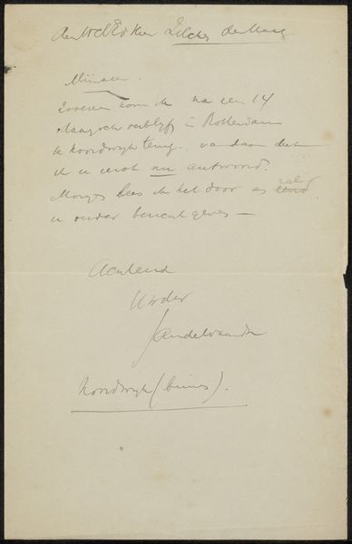
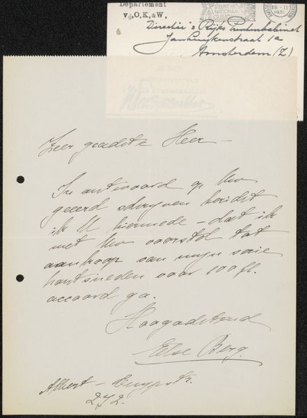
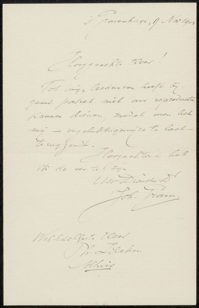
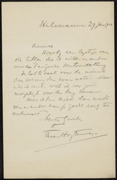
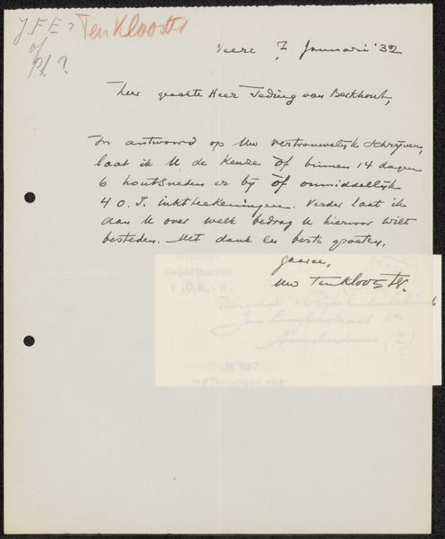
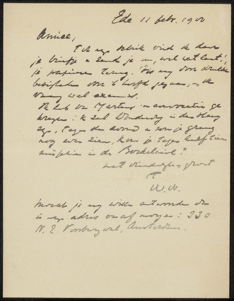
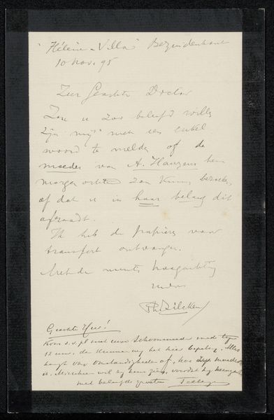
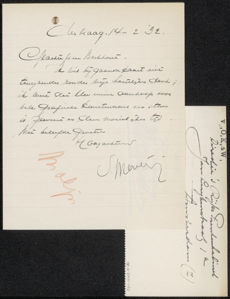
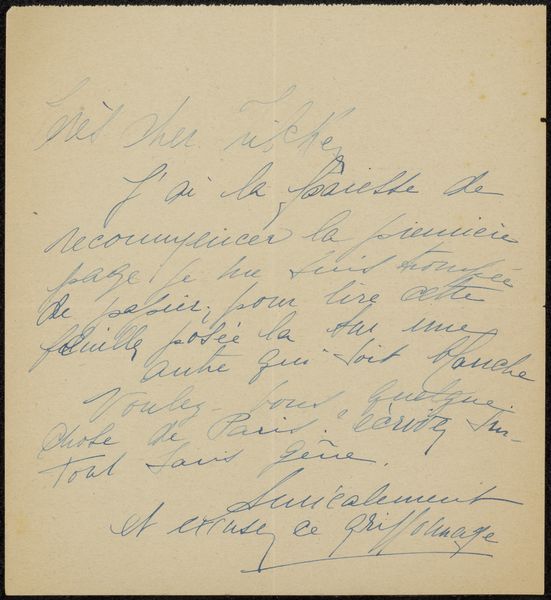
Editor: Here we have "Brief aan Philip Zilcken" a letter drawn in ink on paper by Jan de Waardt, dating between 1881 and 1909. It seems simple enough – a handwritten letter – but something about the arrangement of the text on the page is striking to me. How would you interpret this work? Curator: Observe the careful placement of script and signature, strategically employing line breaks and generous leading for aesthetic effect. Is it calligraphic, or simply handwriting with elevated purpose? Do the slant and pressure of the hand impact our assessment, either through emphasis or omission? Editor: That’s interesting – so, rather than seeing it just as a means of communication, you are focusing on how the text itself functions as a visual element? Curator: Precisely. The weight and directionality of the lines, along with the varying spatial relationships within the composition, guide the viewer's eye across the picture plane. Consider, too, how the texture of the paper interacts with the ink. Editor: You are considering both the writing and the materials in your observation. Could the use of ink on paper speak to a kind of intention as a visual artist beyond the literal textual communication? Curator: Indeed. Even the accidents of the medium— the pooling of the ink or the inconsistencies in line thickness—contribute to the overall visual experience. Would you not agree there exists a certain… deliberate quality? Editor: I think I see what you mean. So, by analyzing these formal elements – the line, the texture, the composition – we can approach the work without necessarily understanding the specific content of the letter? Curator: Quite so. The letter, at a purely formal level, has its own independent existence. I daresay that by removing any semantic information, our study opens exciting new critical and interpretive directions. Editor: Fascinating. I wouldn't have thought to analyze a letter in this way, considering only its visual composition, but it opens up so much for me now.
Comments
No comments
Be the first to comment and join the conversation on the ultimate creative platform.
More like this