drawing, ink, graphite
#
drawing
#
ink drawing
#
landscape
#
ink
#
graphite
#
russian-avant-garde
#
genre-painting
#
realism
Copyright: Public domain
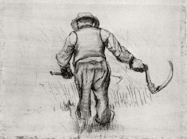
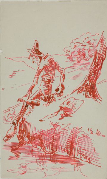
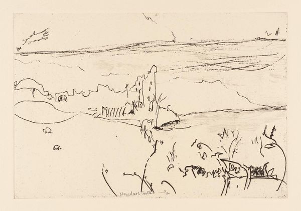
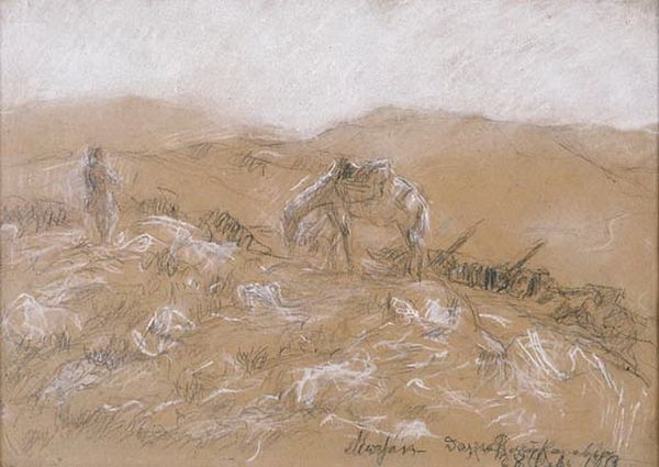
Editor: Here we have Boris Kustodiev’s "From Fishing," created in 1923, using ink and graphite on paper. The stark contrast between light and dark really grabs you, and there's almost a sense of harshness in the scene. What strikes you most about its composition? Curator: Indeed, the dramatic chiaroscuro establishes a compelling visual hierarchy. Observe how Kustodiev utilizes varied line weights to delineate form and spatial recession. The textured application of ink suggests a palpable atmospheric effect, drawing our eyes across the flat picture plane into the imagined three-dimensional space. How do you interpret the angularity in contrast with soft textural rendering? Editor: The sharp angles, especially in the figures and foreground, seem to convey tension, whereas the softer lines in the sky create a sense of depth, almost peace. The contrast feels deliberate. Could the linear details serve as a visual symbol of stress and texture? Curator: An astute observation. Consider, however, the relationship between these linear details and the overarching structure. Do they enhance or disrupt the overall visual unity? Is it about tension, or might the linearity denote action, dynamism? The strategic deployment of ink washes serves not merely to replicate nature, but to generate a dynamic interplay between form and void. Editor: I see your point. It's more about the push and pull between activity and rest within the visual field itself, a construction of form. Looking at this piece has made me think differently about the relationship between line and depth, and how an artist can use seemingly simple techniques to create complex, visual stories. Curator: Precisely. Such works provide unique insight into how fundamental elements operate, quite separate from subject or historical grounding.
Comments
No comments
Be the first to comment and join the conversation on the ultimate creative platform.
More like this